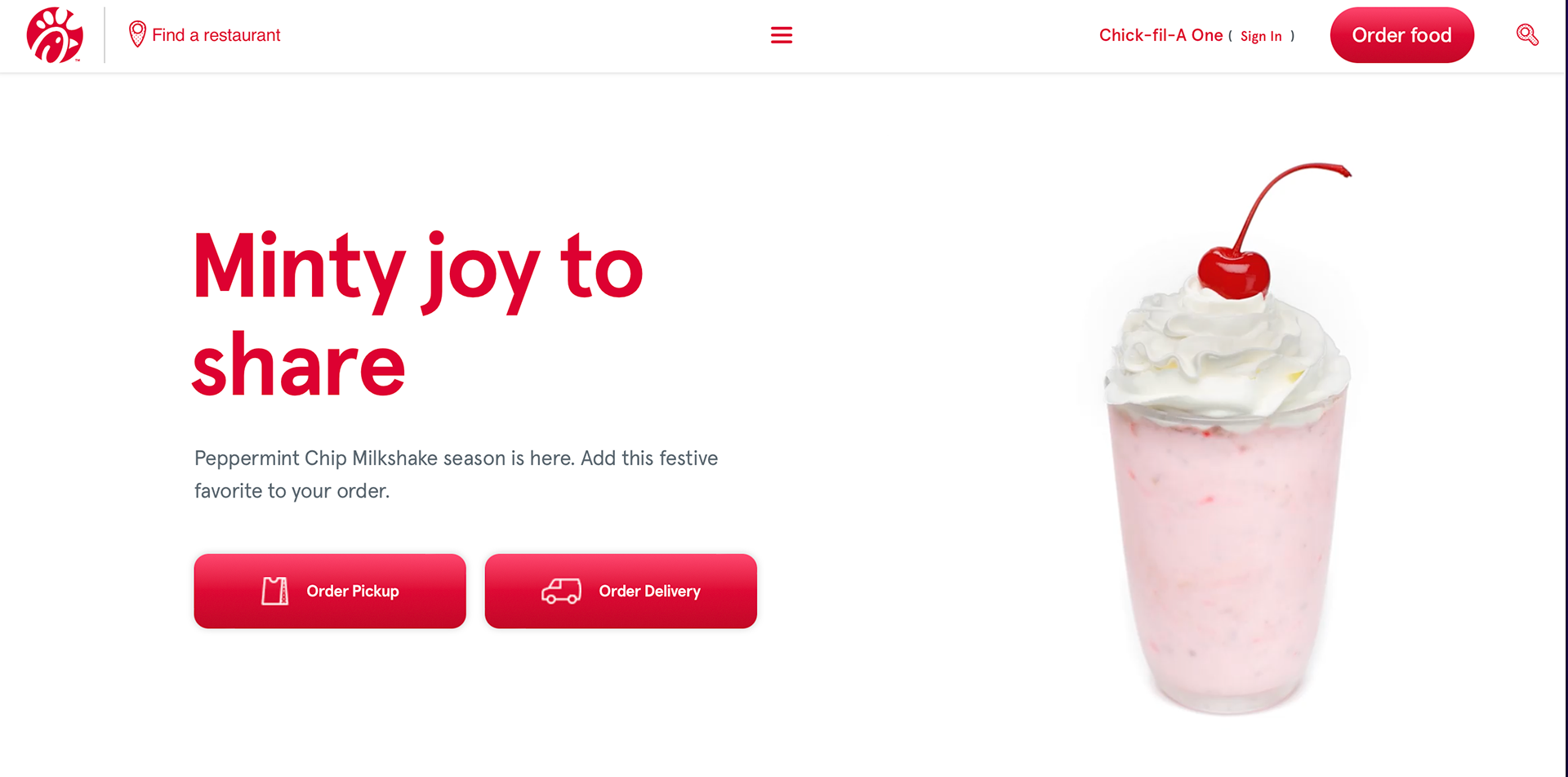
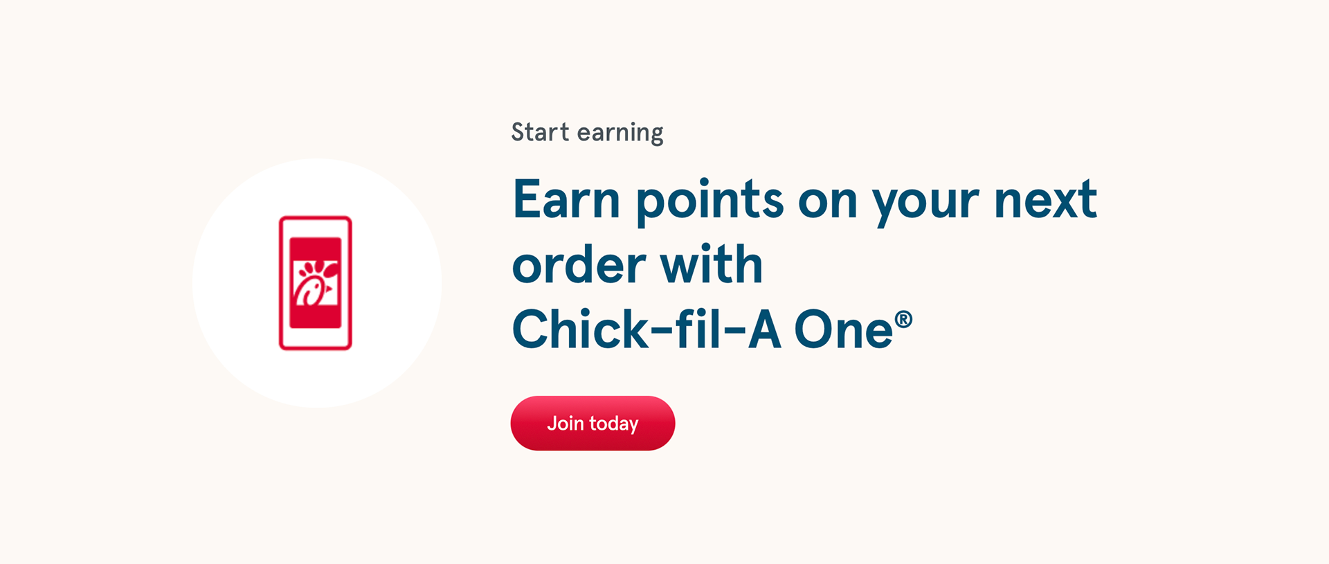
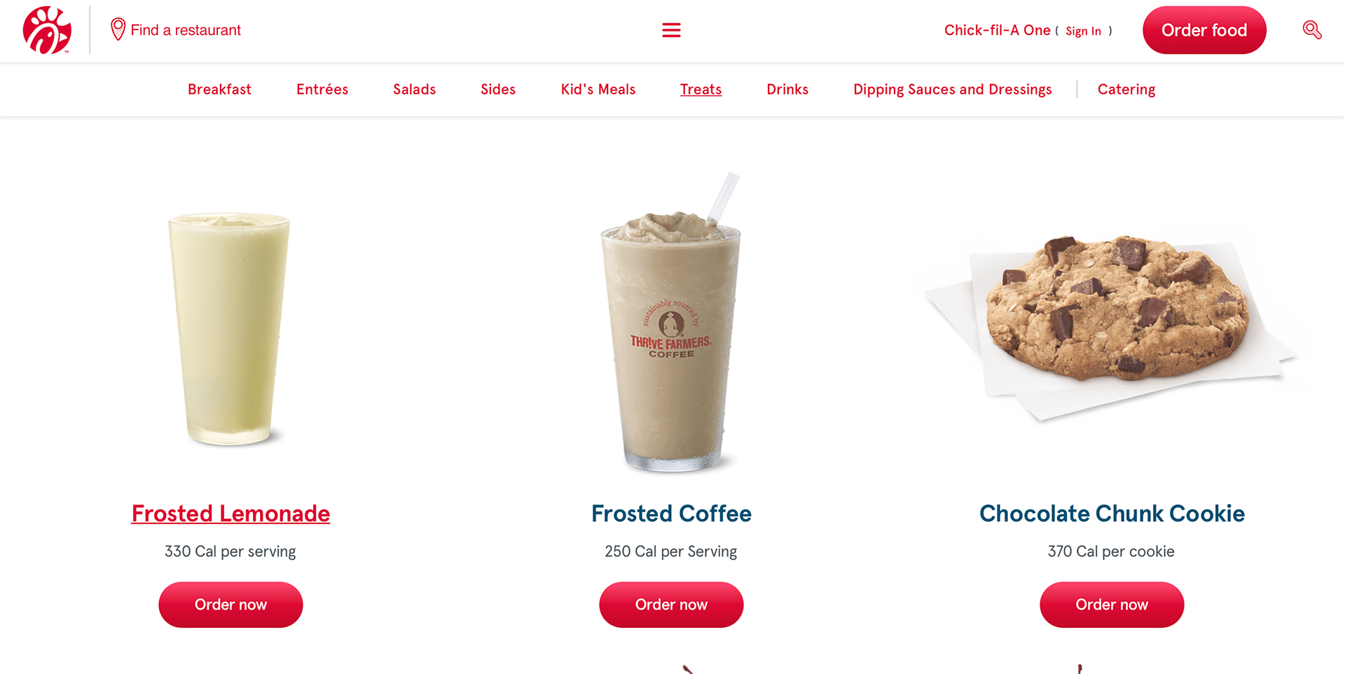
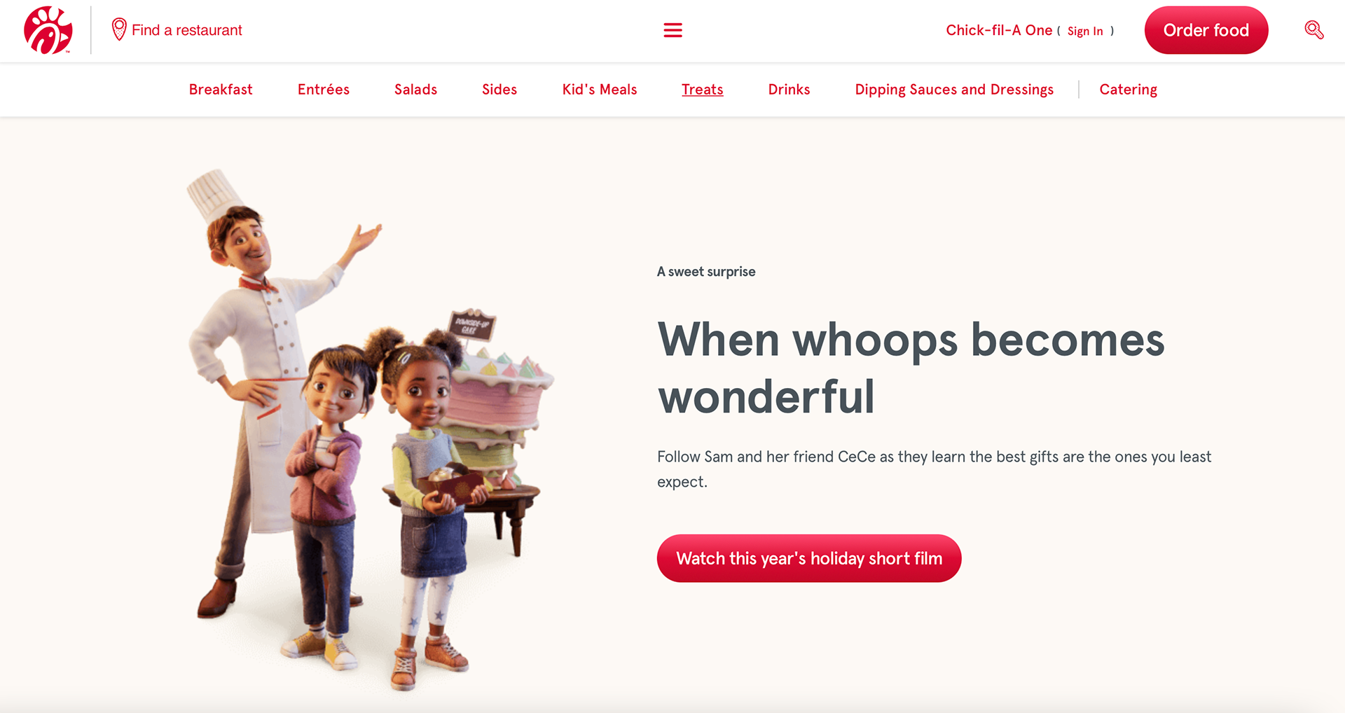
The chick-fil-a website is cohesive in the design. The color of the company is red and it is wisely used throughout the website design. One thing I noticed about the menu was the large images used in the menu portions. The website is pretty plain, there aren't that many icons like other websites have. I think they should have used to icons because they are fun and it would help the website look more interesting. The red round button is consistent and it stands out a lot. It makes the viewer want to click on the button since it is so bright compared to the other elements on the website. I thought it was interesting that they placed the holiday short film link at the bottom. I would have thought they would place it at the top, making it more accessible to the viewer. It also looks like an announcement because chick-fil-a typically does not have cartoon like illustrations. The footer has a hierarchy problem and I think it would look better if the gray text was slightly smaller than it is.
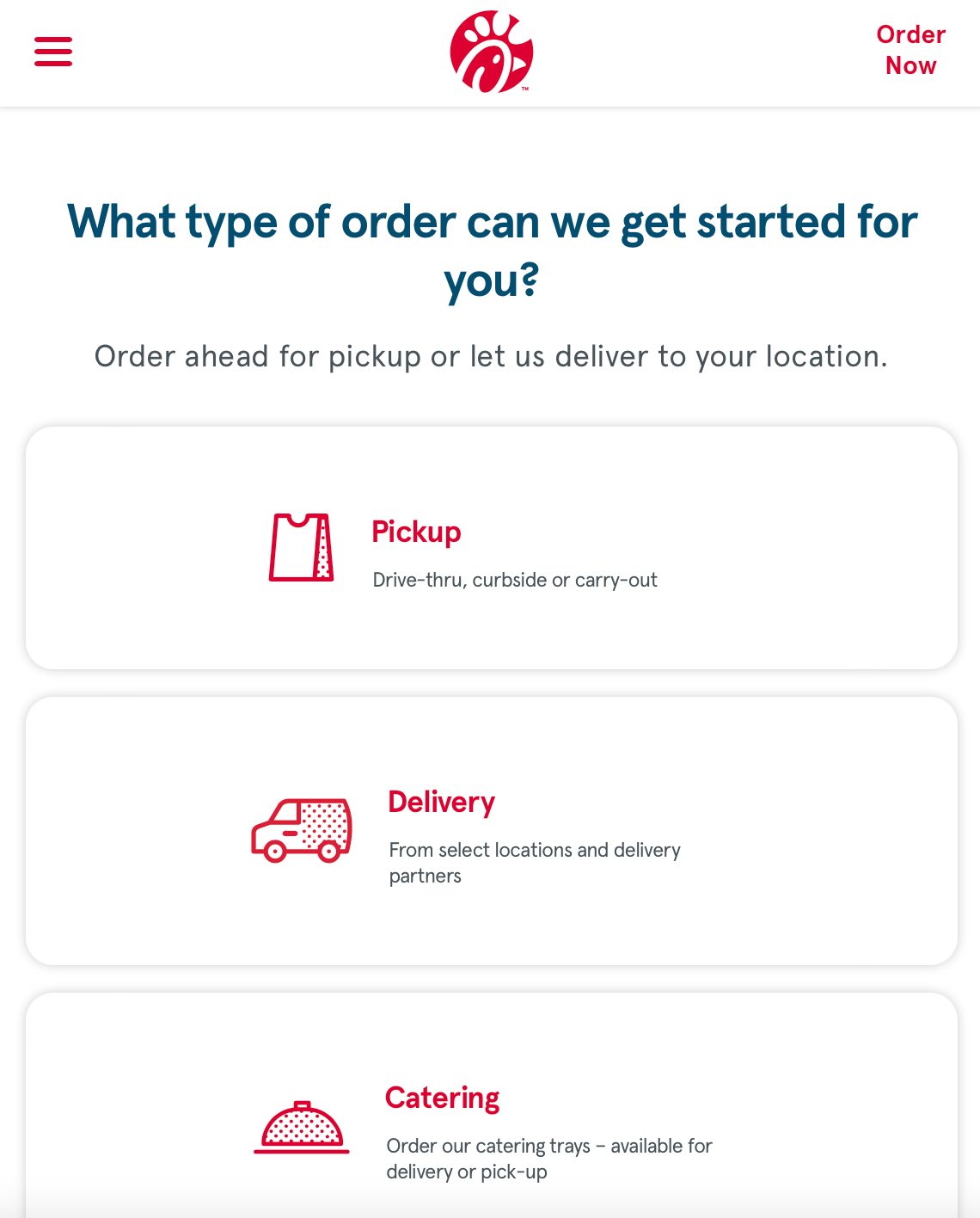
The small browser design is pleasing to look at because it is more organized and there are more design elements. The collapsable menu works well with the design. It also makes it easy to access the categories of the menu without looking too busy. The icons used are nice and they work really well because you do not have to read the text below in order to understand what the icon is supposed to represent. I also like the elements that separate the contents for example the hairline lines and the block of gray used in the background.