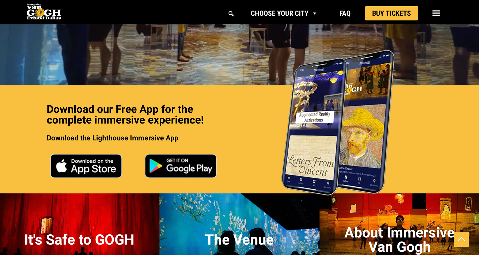
The first thing seen when one goes to the website is a small video of the Van Gogh Exhibit. It is pretty cool to see the artwork on the walls and the people walking around the building. The logo of the exhibit includes a painted sunflower that is from one of the artists paintings. All of the headers are inside the hamburger which is weird because those are typically seen in iPad and iPhone layouts. Some of the headers lead to the same html link which means the list could be shorter or the headers could have sub headers in them.
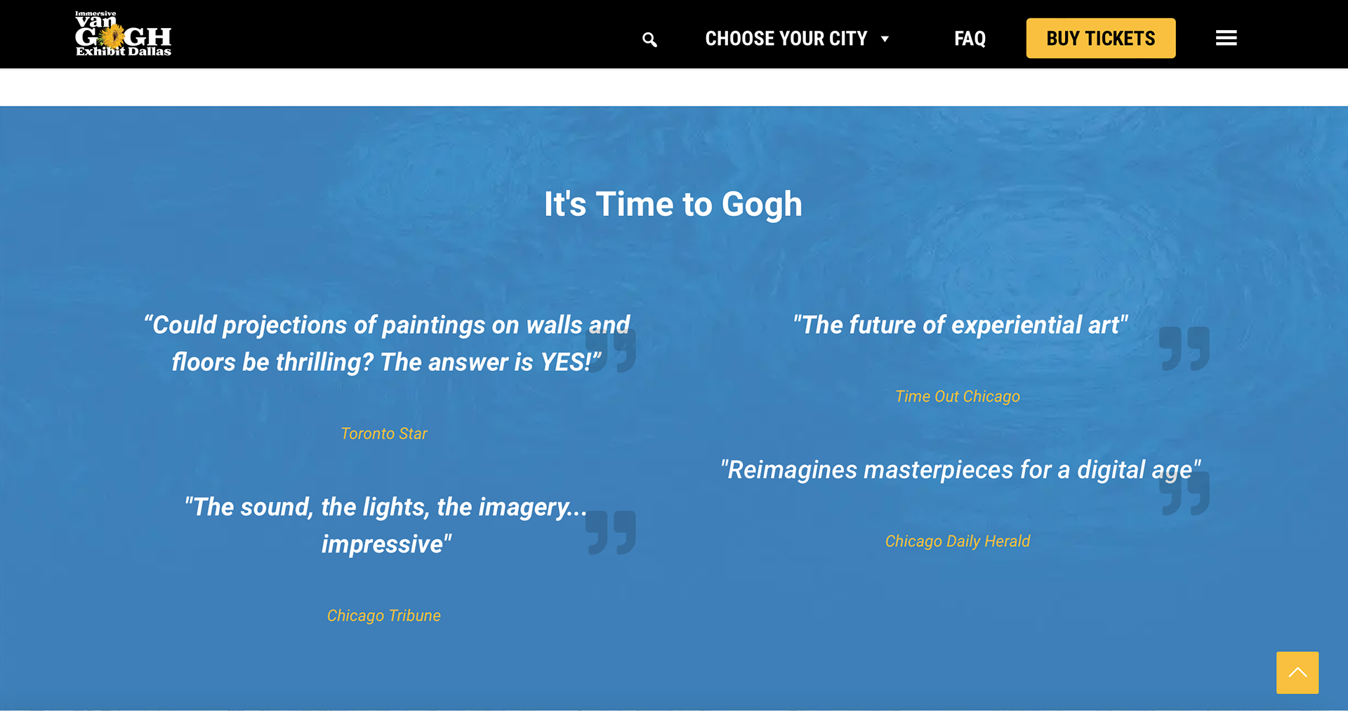
The website is overall organized but it is text heavy. This can cause the website to look busy especially since it contains colorful images in them. The main colors seen are blue, yellow, black, and white. The colors are used to separate the website into sections and behind the colors is an image of the sunflower painting. I think some of the elements in the website could have been removed to make the website less busy.