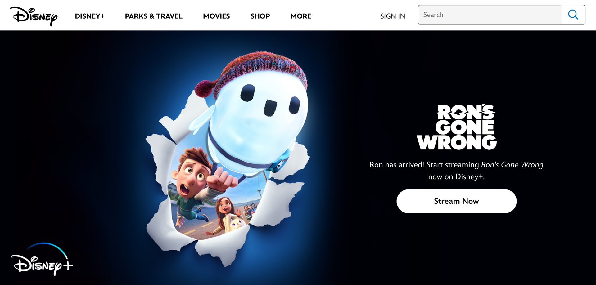
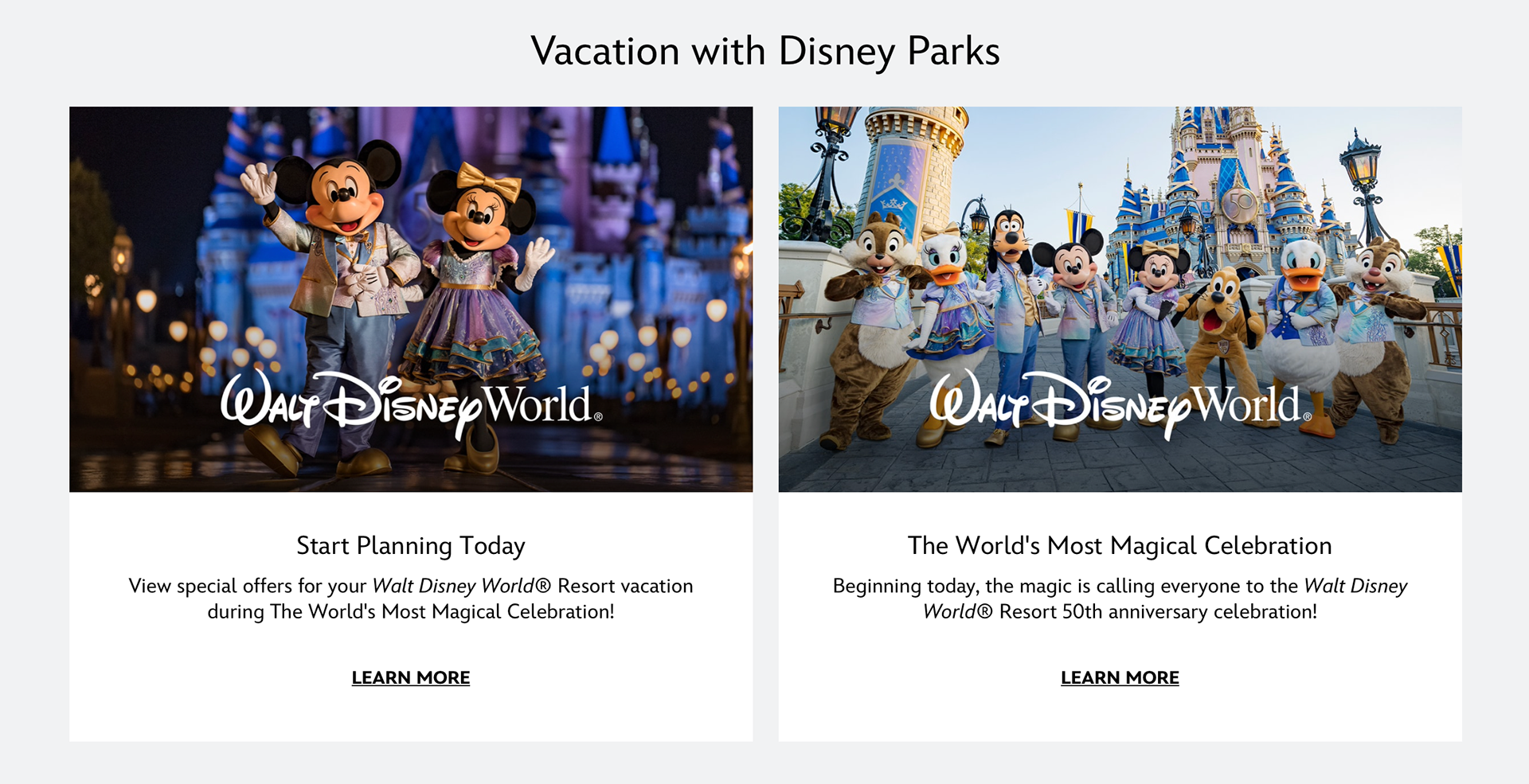
The Disney website is different from what I expected it to be but I think the design works well with the company website because they have busy energetic images. The colors used on the website are neutral colors allowing the images to stand out and it allows the website not look too busy. The website sdvertises Disney+ a lot more than the other things Disney has to offer. Some sections look like blog posts that let the viewer know what Disney is currently working on and what is to come from Disney in the next few months. Disney does have a section for their parks and it gives a brief description of them along with a link to allow the viewer get more information about them if they want the information. There is also a section that promotes their cards and the cards have Disney designs for anyone who is a Disney fan. I think keeping the logo black works well with the design of the website and it does not distract from other information seen on the website.