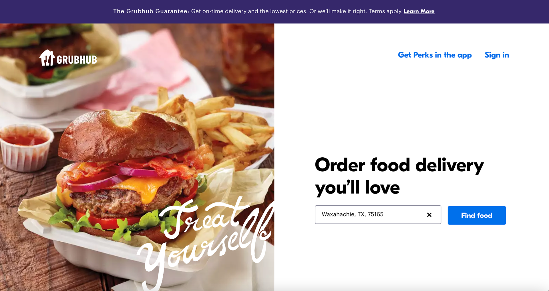
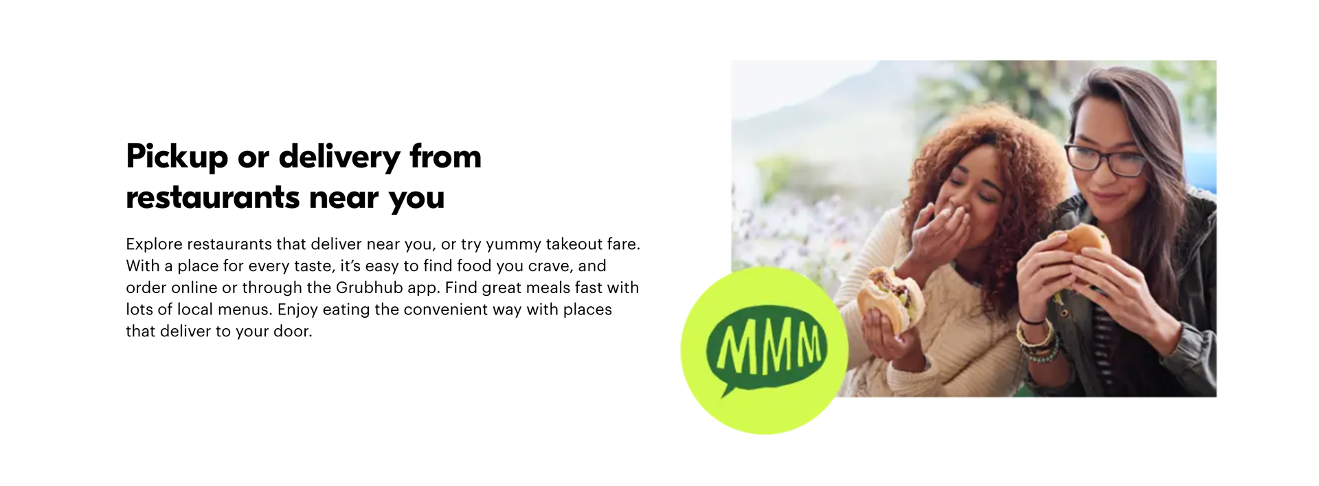
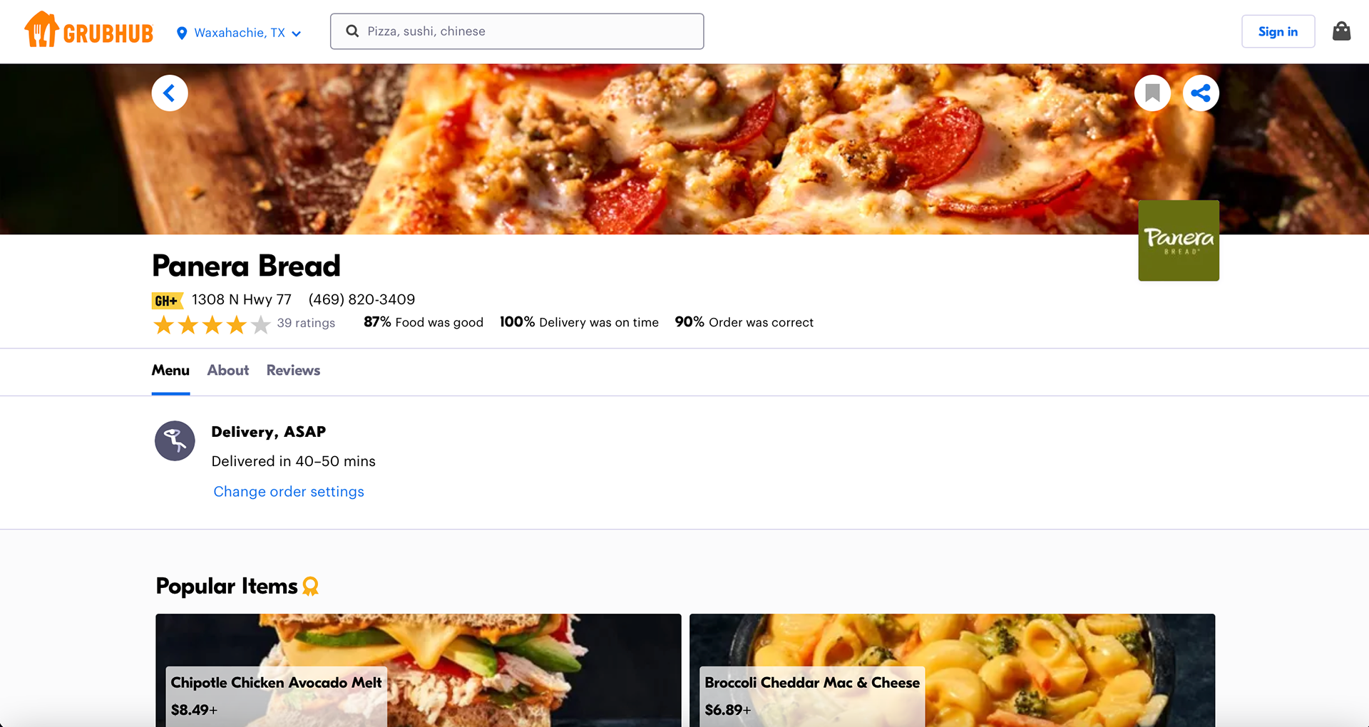
The GrubHub website is pretty simple but has a lot of sections to it. I think it is difficult to organize information for a delivery service website simply because so much information has to go into it. It also changes depending on the location of a person. The overall design colors were cohesive. The illustrations used were fun and make the website not so boring or text heavy for the viewers. When you click on a specific restaurant the colors obviously change to fit the restaurant colors. I thought it was interesting to see the footer a bright blue color.
![](https://cdn.myportfolio.com/e194a106-5fb5-4770-8315-af0a352ef87b/e39216e2-02e8-4e27-9ba7-c302e3716f79_rw_1920.png?h=99f94123c56ea7d5645cb59133f7f700)
![](https://cdn.myportfolio.com/e194a106-5fb5-4770-8315-af0a352ef87b/8681a7d7-16de-49c6-91ca-8cb061e0c167_rw_1920.png?h=0c40166951d6e8a345d8651deb617078)
![](https://cdn.myportfolio.com/e194a106-5fb5-4770-8315-af0a352ef87b/f00ac25d-1938-4563-adf8-43d6c0fb113c_rw_1920.png?h=db6f6504cef6720f9c42c8356a6903e9)
![](https://cdn.myportfolio.com/e194a106-5fb5-4770-8315-af0a352ef87b/05cc90c9-00bf-4e03-bfdd-d6a077deff99_rw_1920.png?h=632b16cb263b1ccf5dd225e3fa09dbc8)
![](https://cdn.myportfolio.com/e194a106-5fb5-4770-8315-af0a352ef87b/2a37b085-c0a3-4a55-b2d6-02c626cae768_rw_1920.png?h=8372f40a9c26a8bdac6bd0a372931010)
![](https://cdn.myportfolio.com/e194a106-5fb5-4770-8315-af0a352ef87b/ee67dd0c-6db1-4a0b-9a7d-74deb7130338_rw_1920.png?h=8e812abbfab6885b37b1a41f6d648bd7)