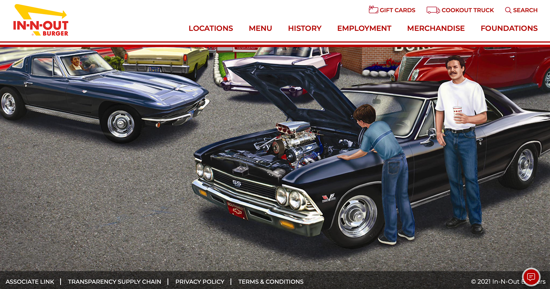
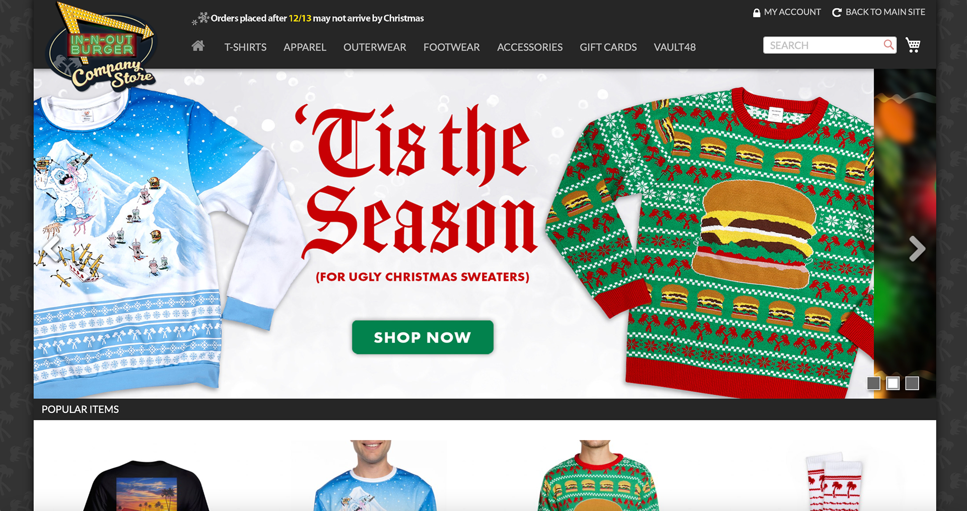
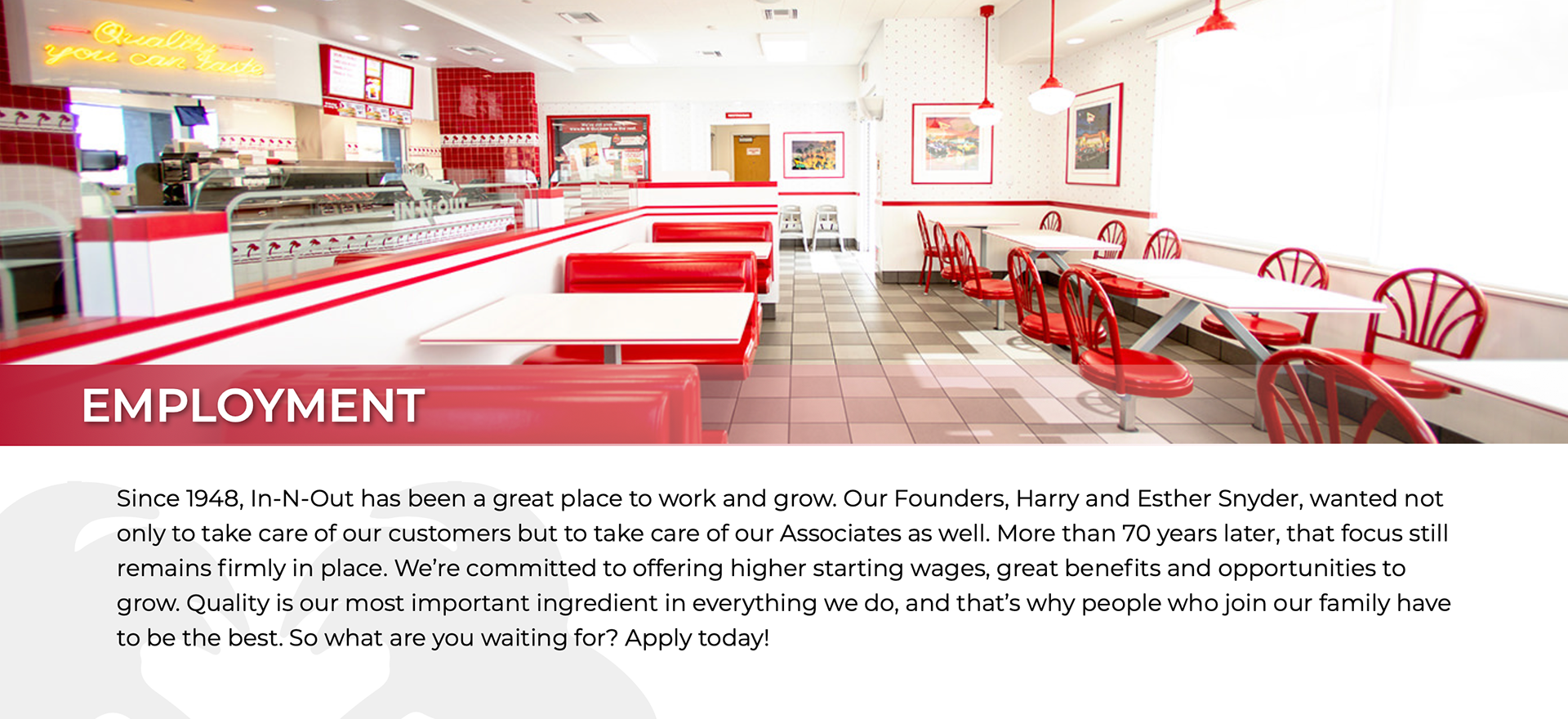
When visiting In-N-Out Burger’s website you are greeted with a very bright and busy home page. They maintain their signature white and red thematic throughout the webpage just as you would see inside of their restaurants. This palette can be a little rough on the eyes online though, because the colors are so bright they somewhat overpower the images on the page. The photoshop work on the images is also a bit lackluster and the site has a footer that is much too large in comparison to the rest of the page. The menu bar is well done being both simple and functional with many of the tabs being much cleaner than the home page. In particular the merchandise tab is nice as it has a neutral theme which moves focus to the colorful images of the merchandise that they offer.