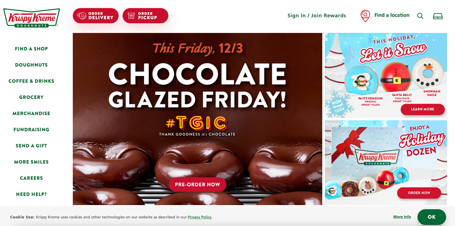
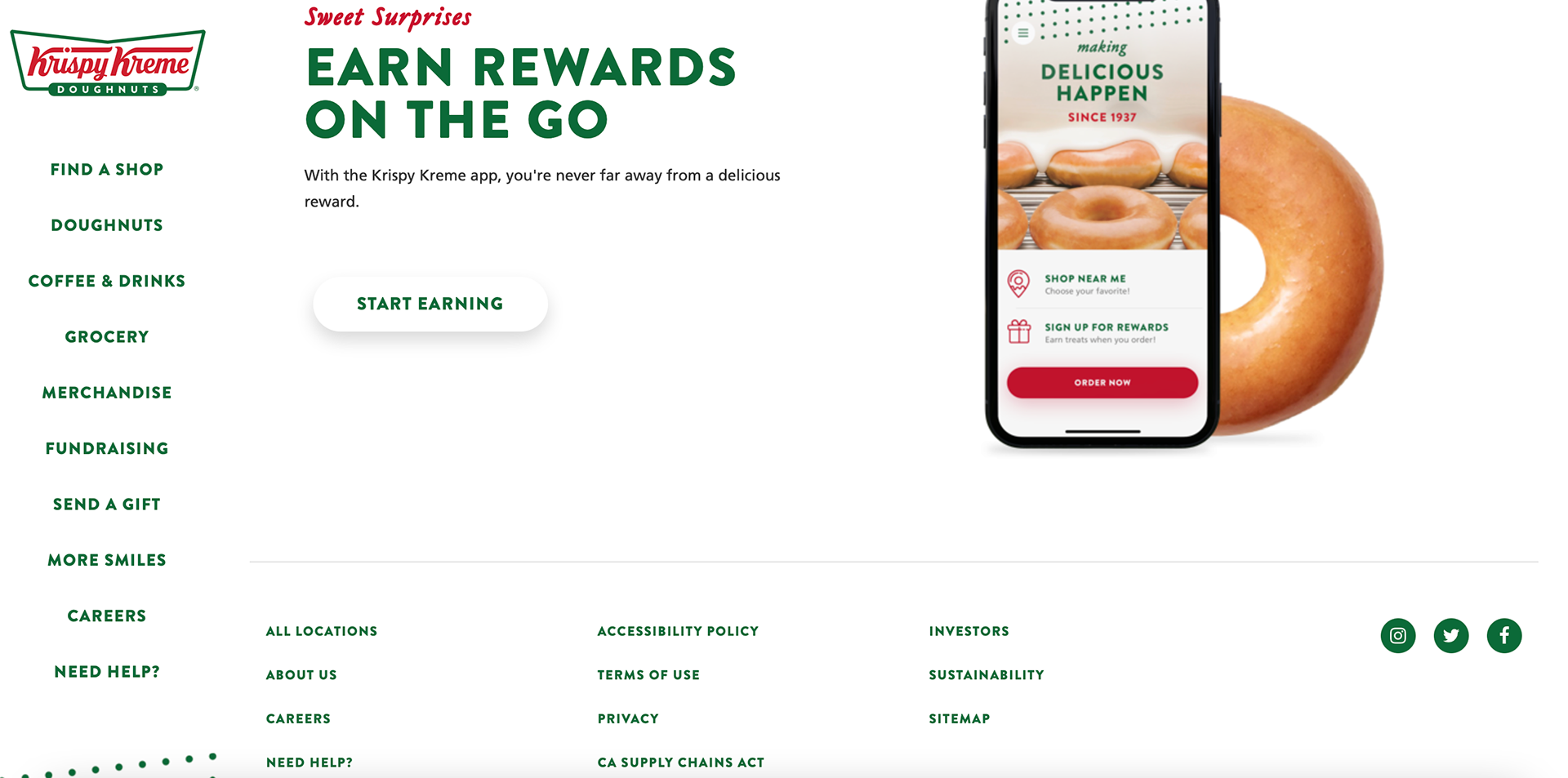
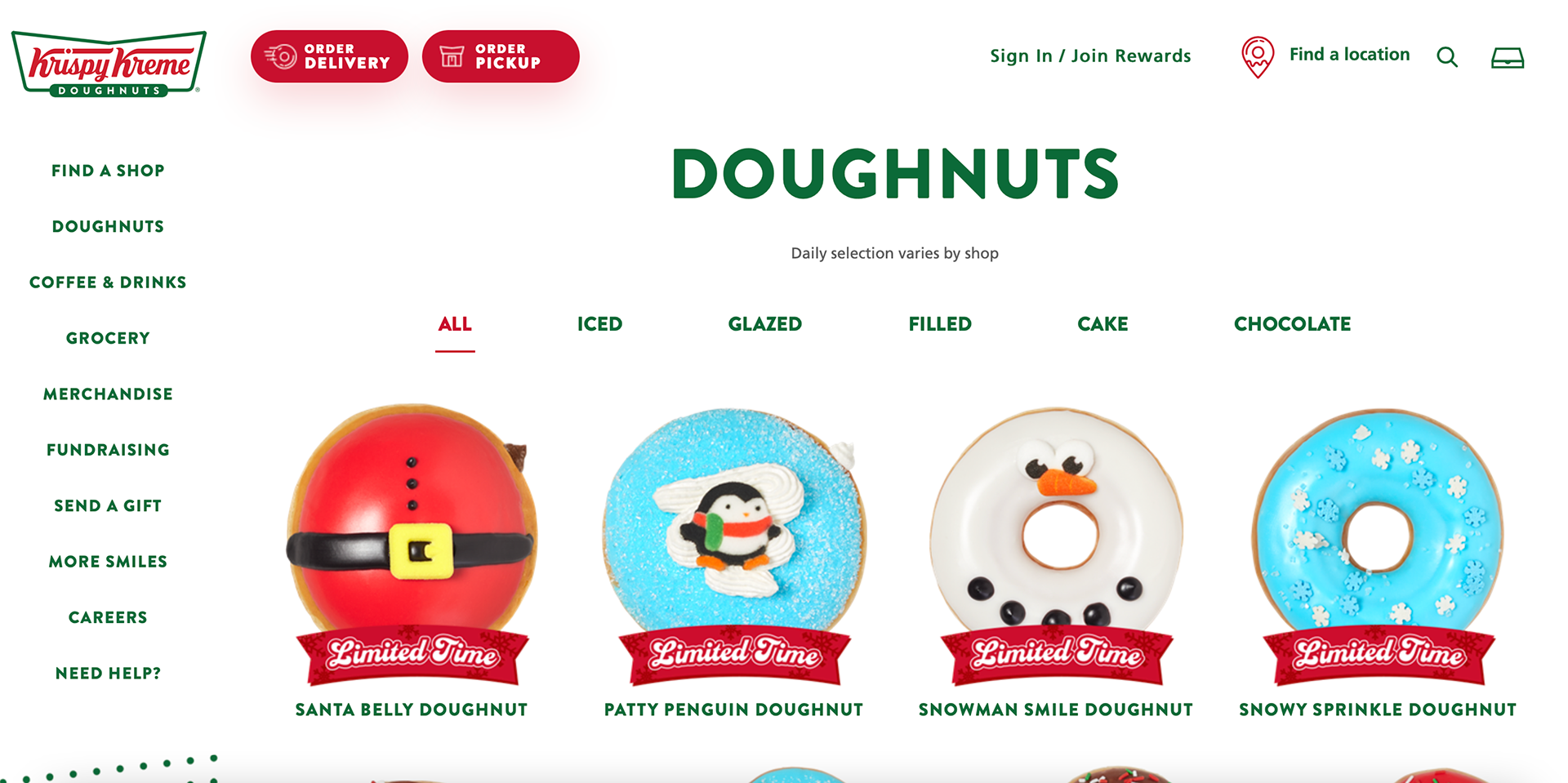
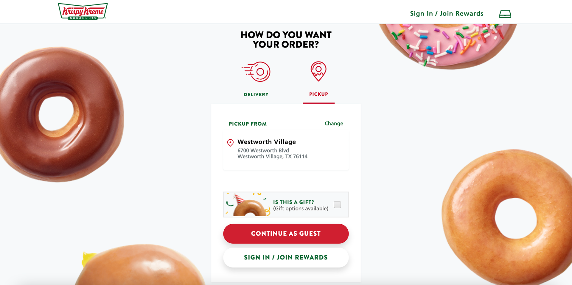
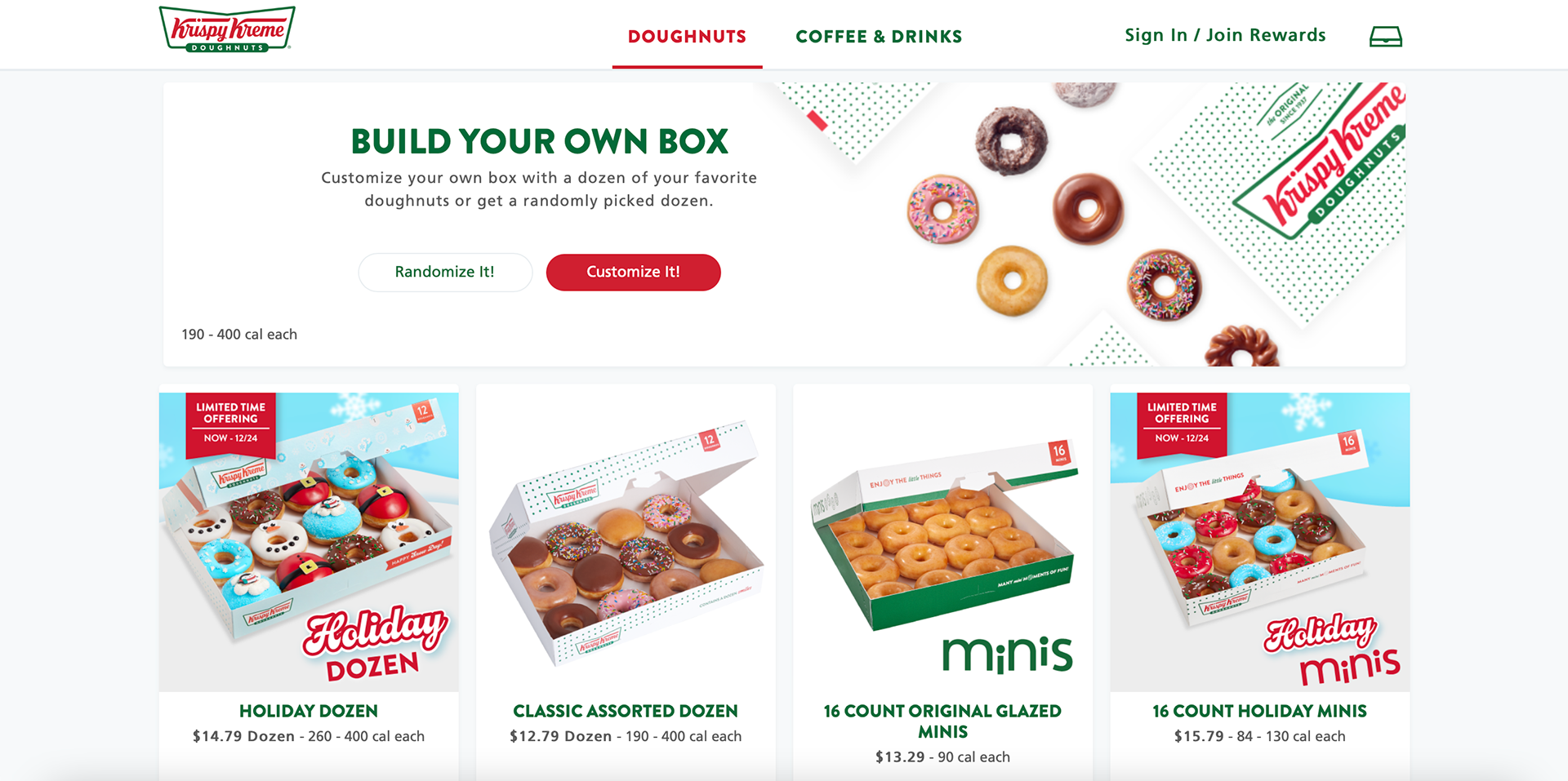
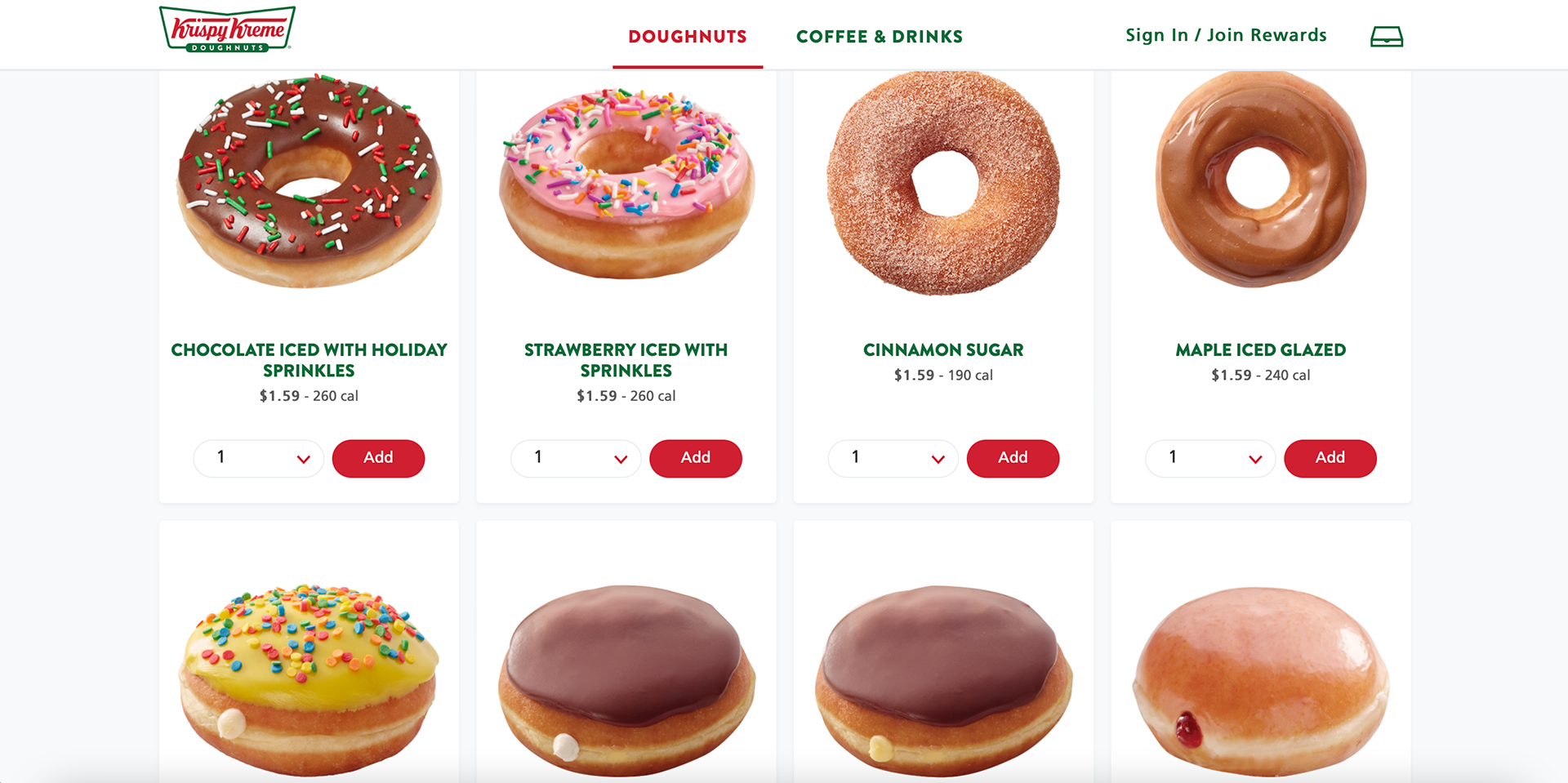
The Krispy Kreme website has a different menu layout from other websites. The menu bar is located vertically on the left side of the homepage and remains there as you scroll down. The only time it leaves is when you click on one of the menu options. The first thing seen is the new season products that are available to the clients. The doughnuts are bright and fun making it easy for the viewer to notice the product when they open the website. The company colors are seen throughout the design of the website. The green is used a lot more than the red, letting the viewer know the important stuff is in red. The products on the menu are organized and large on the webpage. They almost create a pattern when one looks at them. It is clear which products are limited time and they are on the top to try to convince the audience to buy those products. When you click on the order button it takes you to a cute section that allows you to choose the location you would like to pick up what you ordered. The ordering menu is very similar to the general menu the company has the only difference is the angle, price, and amount a customer would like to purchase. I think the colors make the company look very Christmassy all year long and it also gives it a very homestyle company that has been around for a long time.`