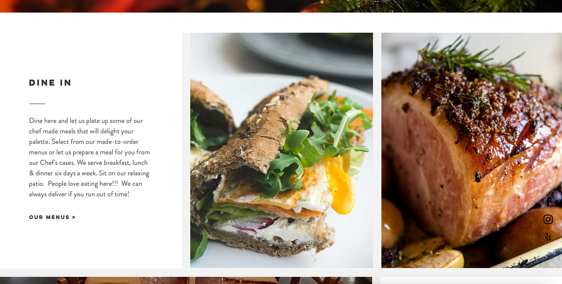
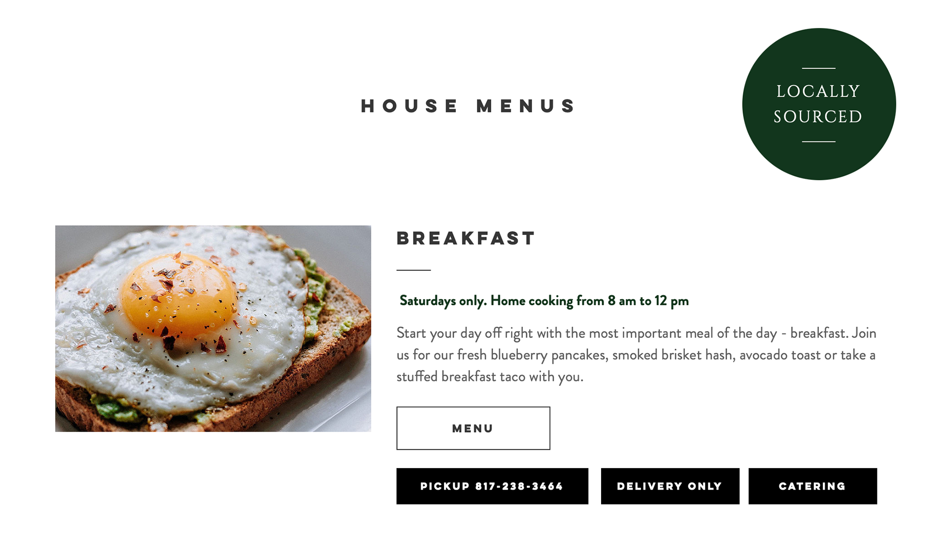
The website is for a restaurant located in Fort Worth. I enjoyed looking at the hero image of the website because it almost looked like they are trying to feed you the burger. I also enjoyed the black header which causes the image to be the hierarchy of the website. The fonts used are consistent throughout the website which makes the design cohesive. The images used are high quality, making the food appealing to the viewers.
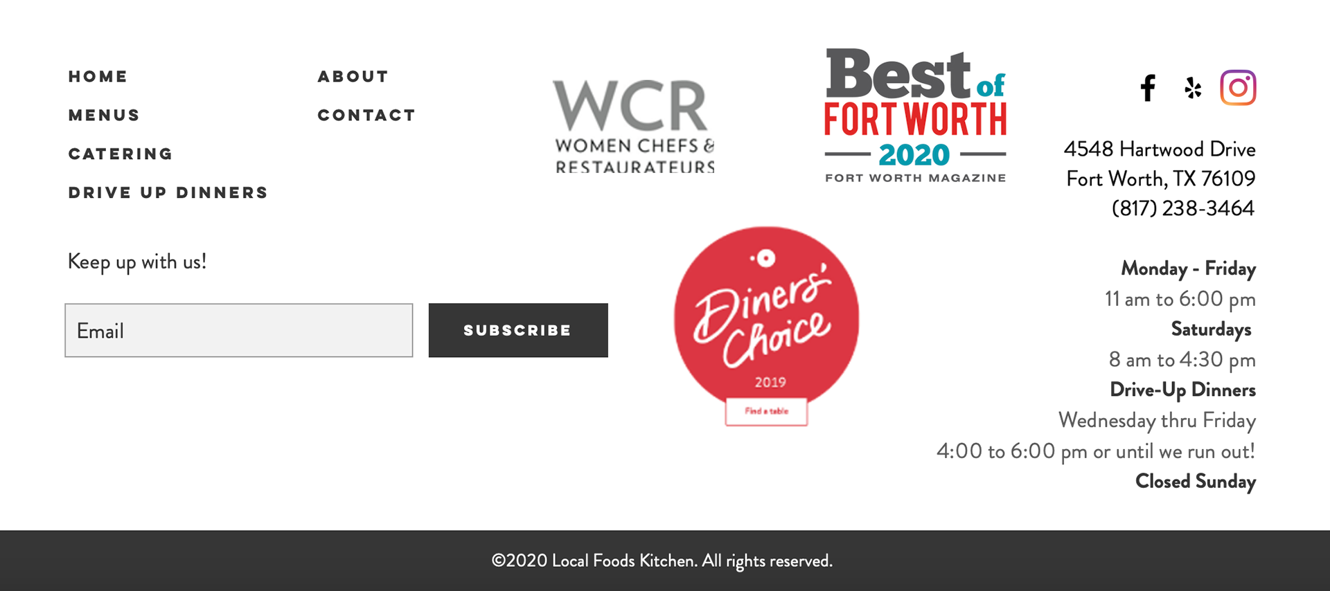
One thing I think does not work well is the footer of the website. I think the information could have been organized better without making it so busy and overwhelming to look at. The logos seen at the bottom are distracting the viewer from important information about the restaurant. The social media links are seen twice which can be confusing and it also takes up space that could be used to space the information out in the footer.


