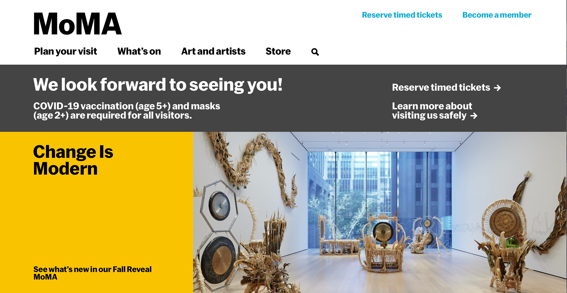
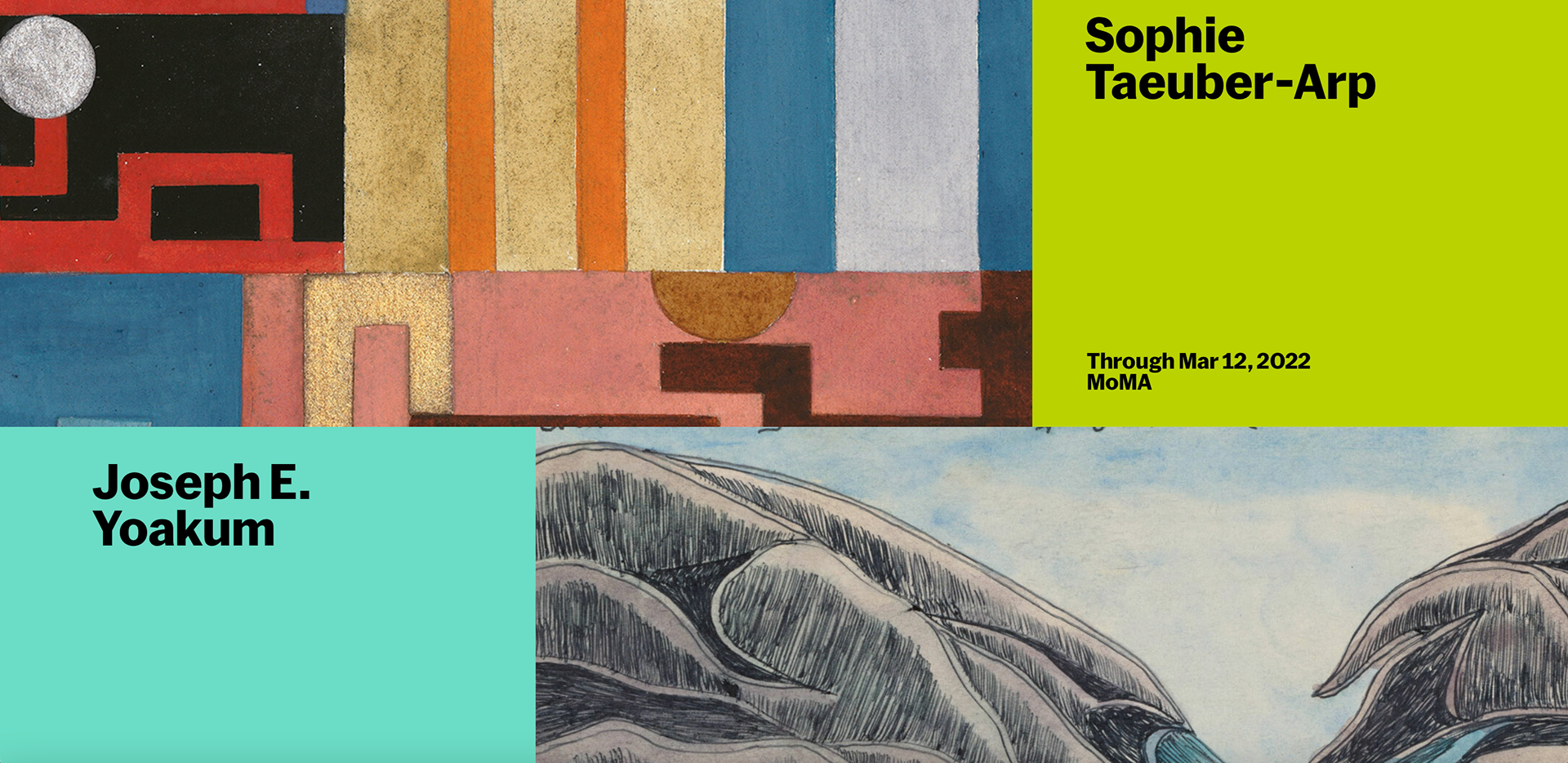
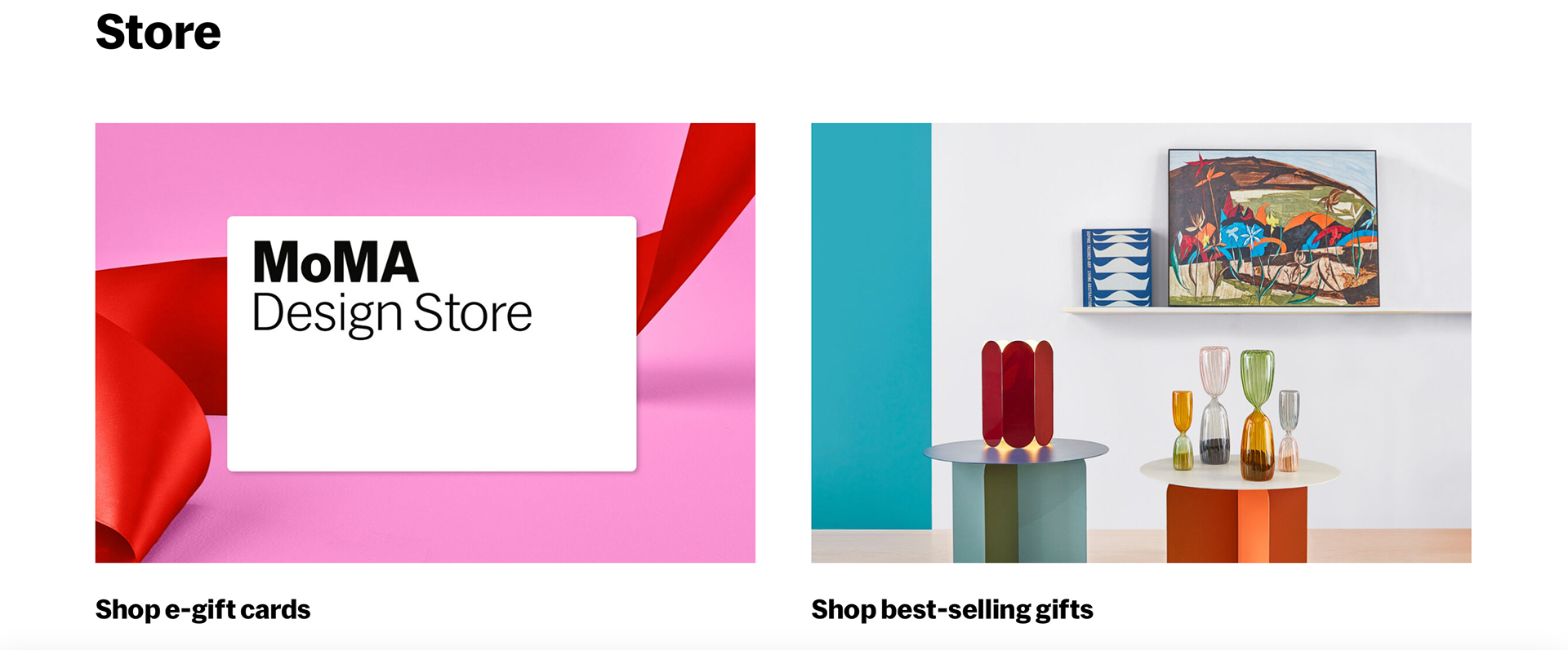
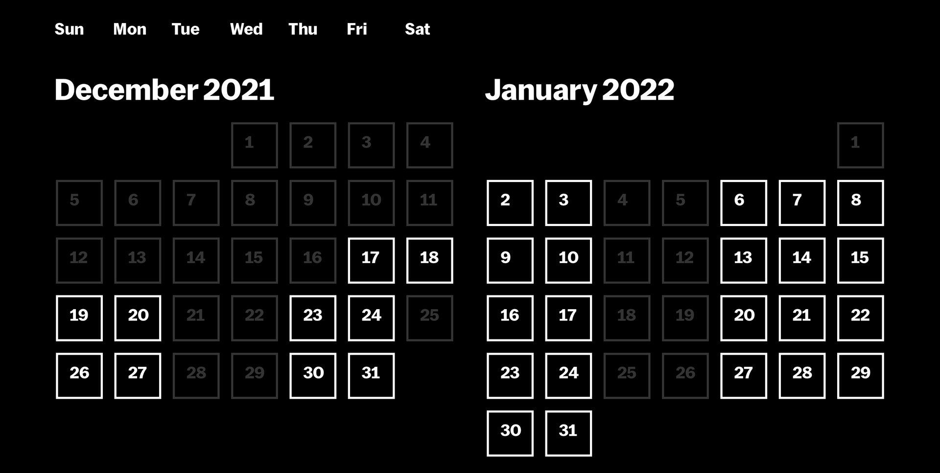
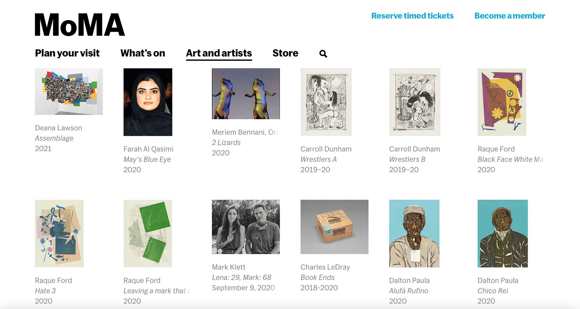
The MoMA website has a lot of information in it making it hard to find things. The website only uses black and white in order to make the artwork the focal point of the website. The home page is really bright making the information stand out and interesting to look at. The way it is sectioned off is almost artistic and keeps the audience engaged. It makes the viewer want to read the information presented. The calendar has a clean look but it is difficult to tell what days are available unless you click on them. The website is sectioned off nicely making it nice to look at.