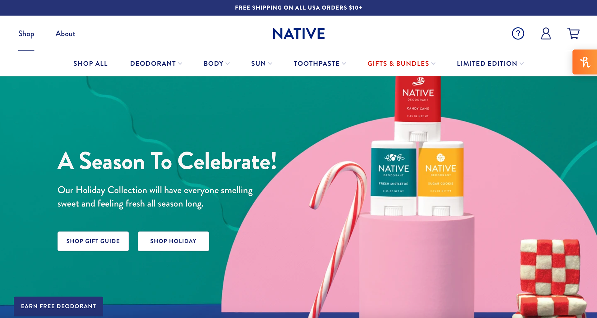
When you first look at the Native website the first thing seen is a hero image of the limited scents Native has to offer. The color of the company is seen throughout the entire website to keep the website on brand and cohesive. The white background adds to the cleanliness of the products and allows the website to not look overwhelming since there are many colors for the products.
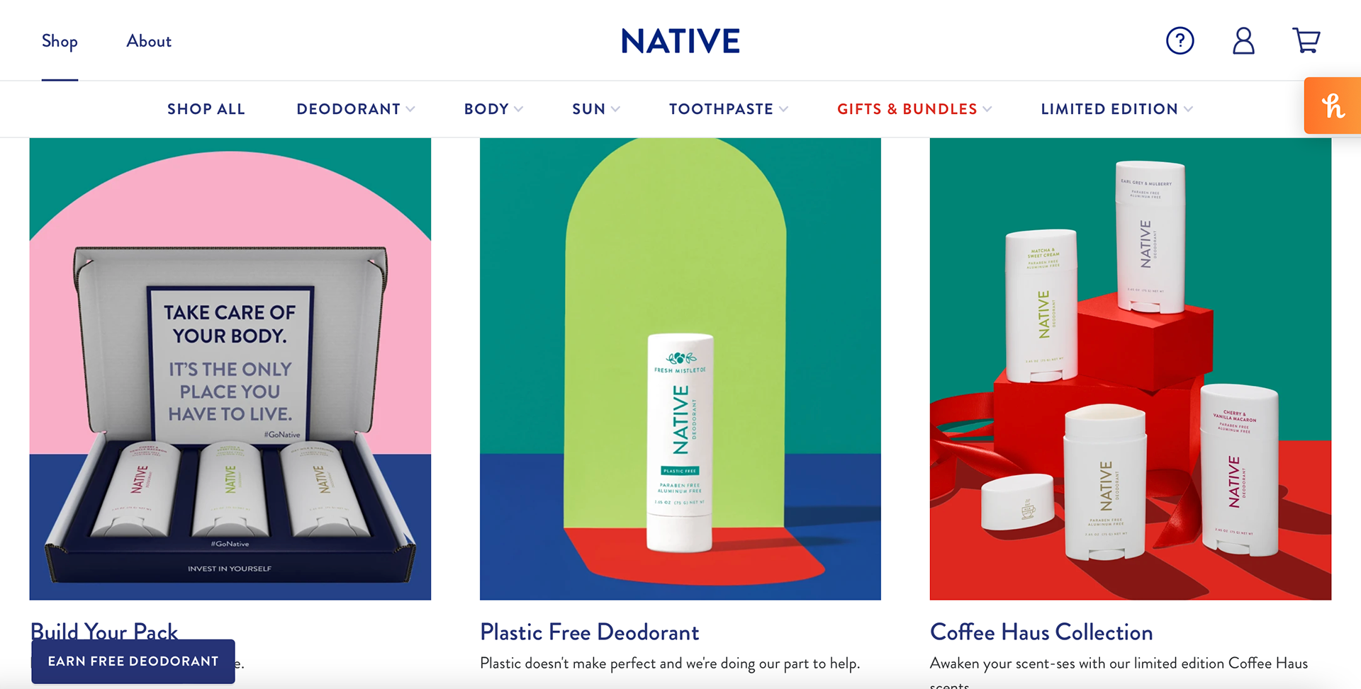
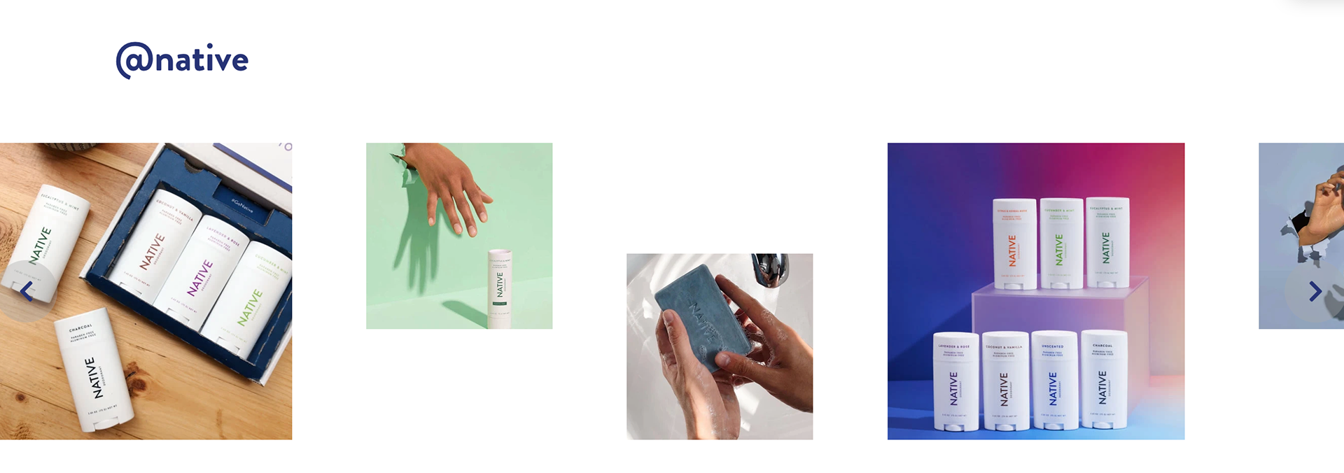
After that, a panel of images is seen with some options they recommend buyers to purchase. The products are organized in the images and the white packages stand out from the color backgrounds. The blue color continues to be seen in the text and in the small illustrations. The illustrations seen help the website not seem text-heavy, which can cause a viewer to skip over information a company would like for them to know.
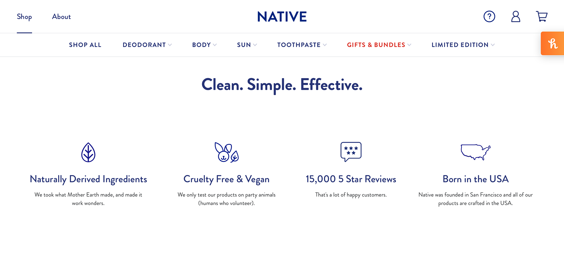
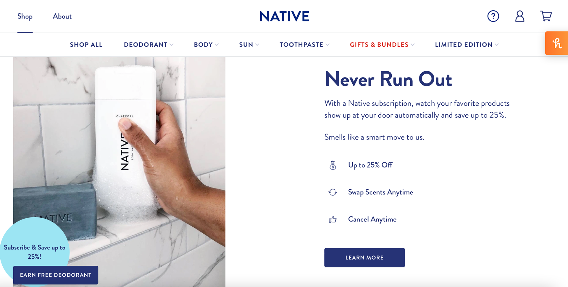
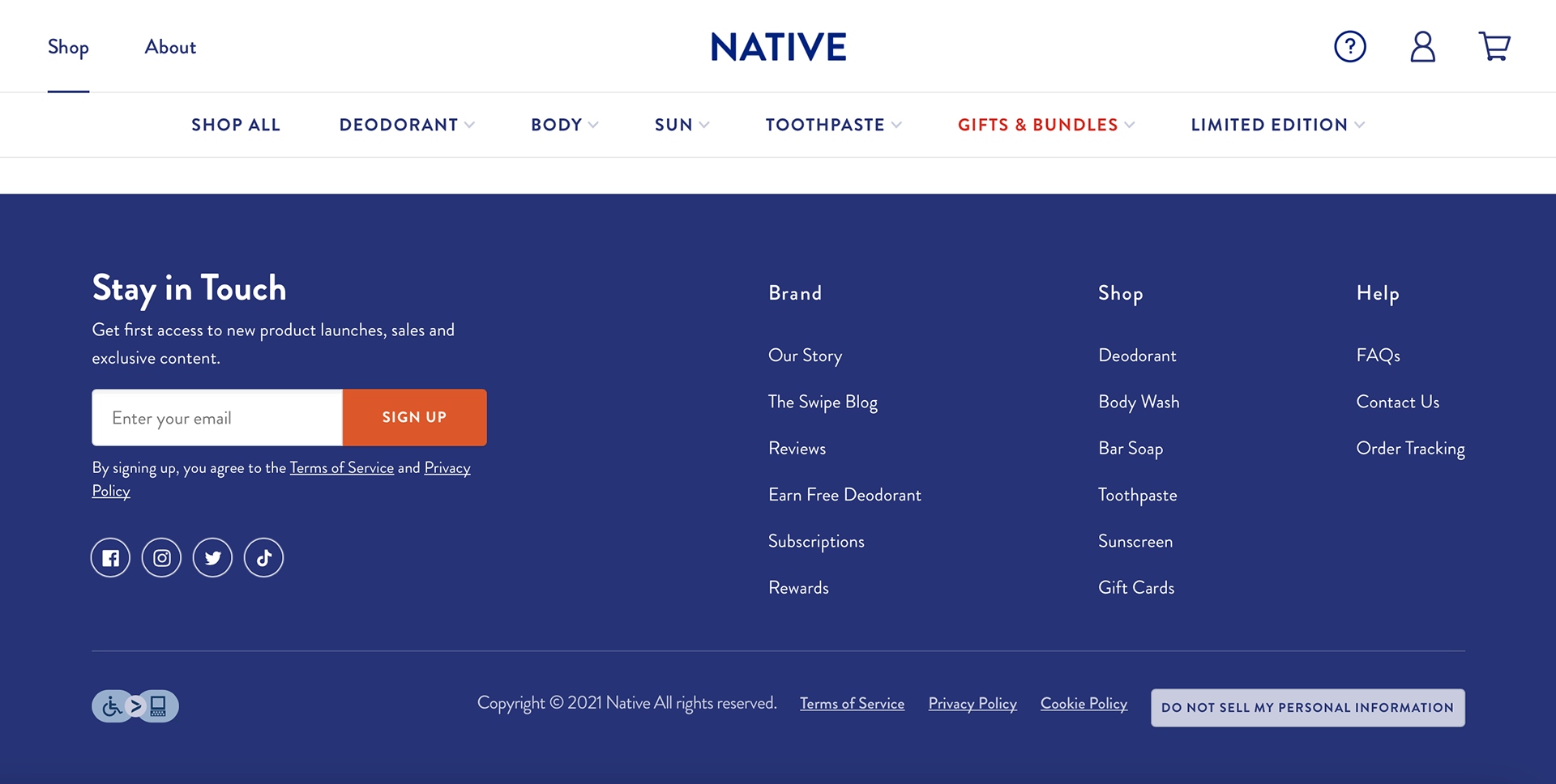
As a viewer continues to scroll down the website more information is seen regarding the popular products and subscriptions. The footer of the website is the blue of the company and it contains information seen in the navigator above. One thing I enjoy about this website is how bright and clean the website is. One thing I would change would be the social media section because the images are different sized and are aligned differently. I enjoy the icons the website has because they are simple and easy to understand what they are supposed to represent.