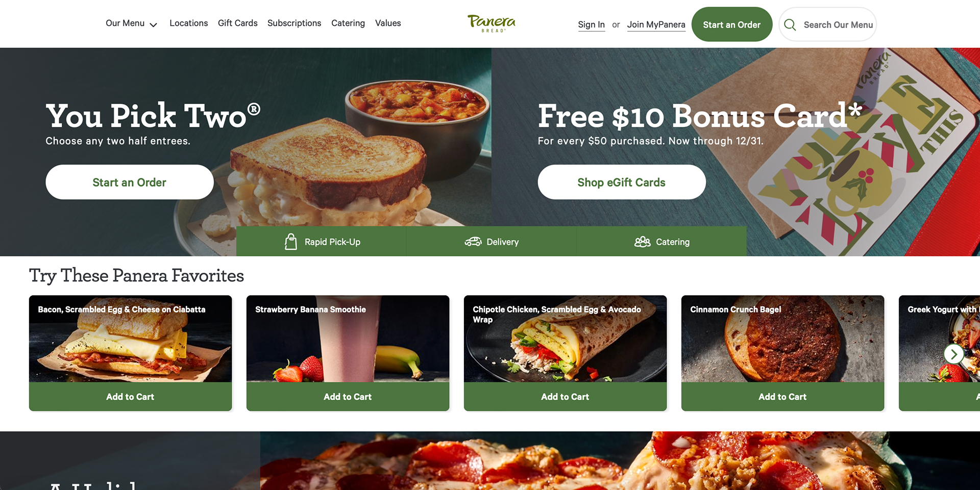
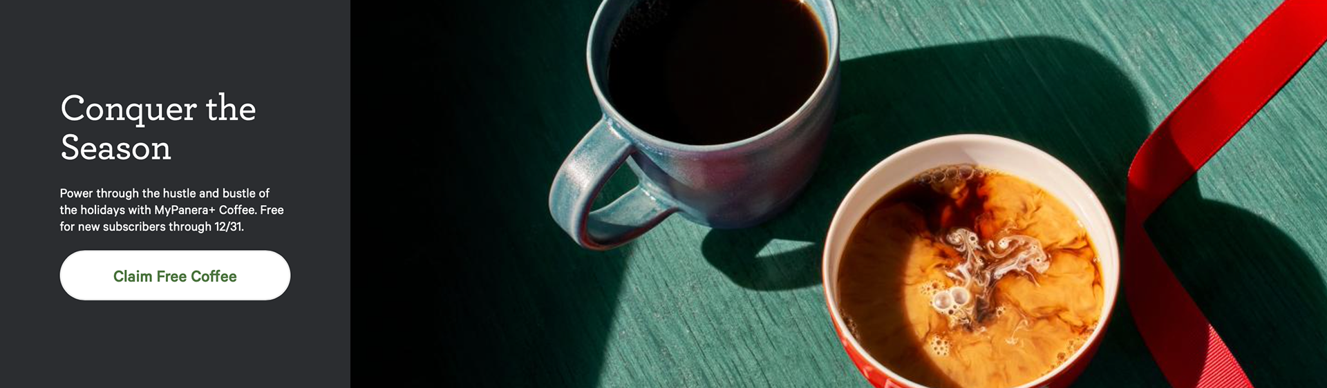
Panera has a very clean and cohesive design that works well. The company color is seen throughout the entire design but it is not too overpowering to look at. The website is very welcoming, it almost gives a homey look. The small line illustrations seen around the website works well and adds to the design of the website. They also give the viewer an idea of what the restaurant sells. The top part of the homepage reminded me to a delivery service website which I thought was interesting to see first on a website. As you scroll down the website has pretty hero image sections which I think could have worked better at the top.