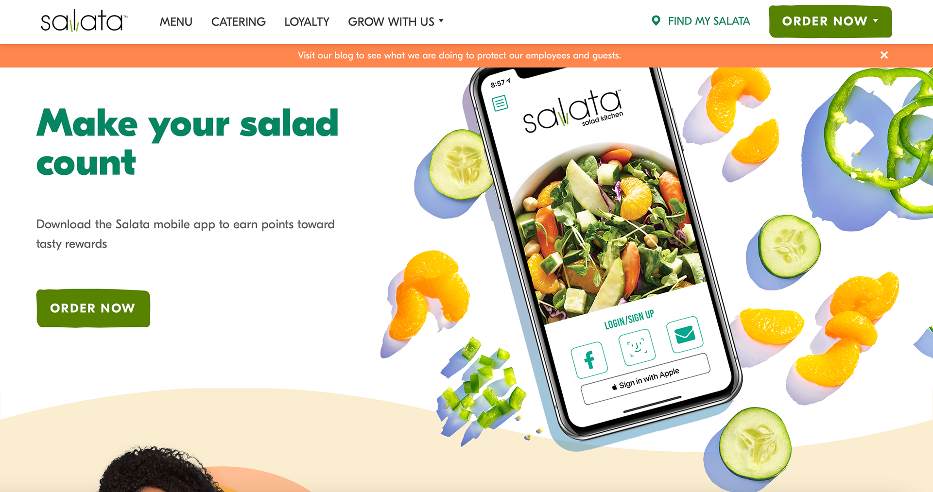
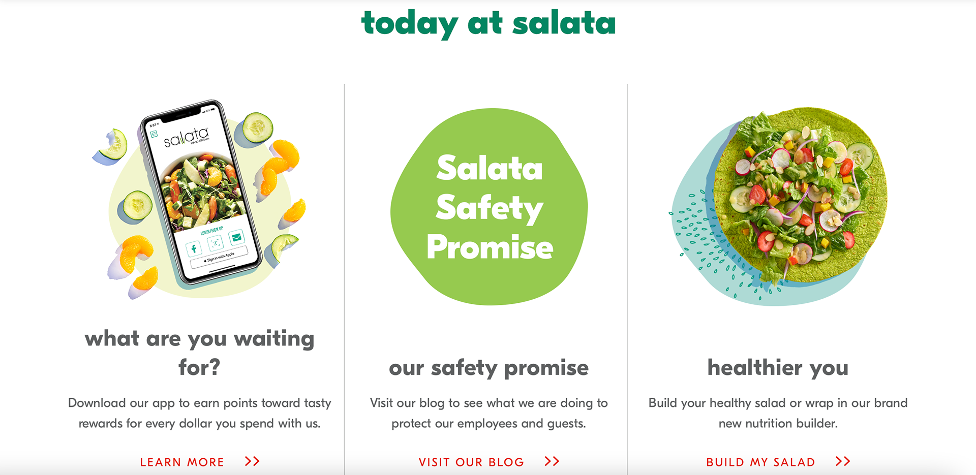
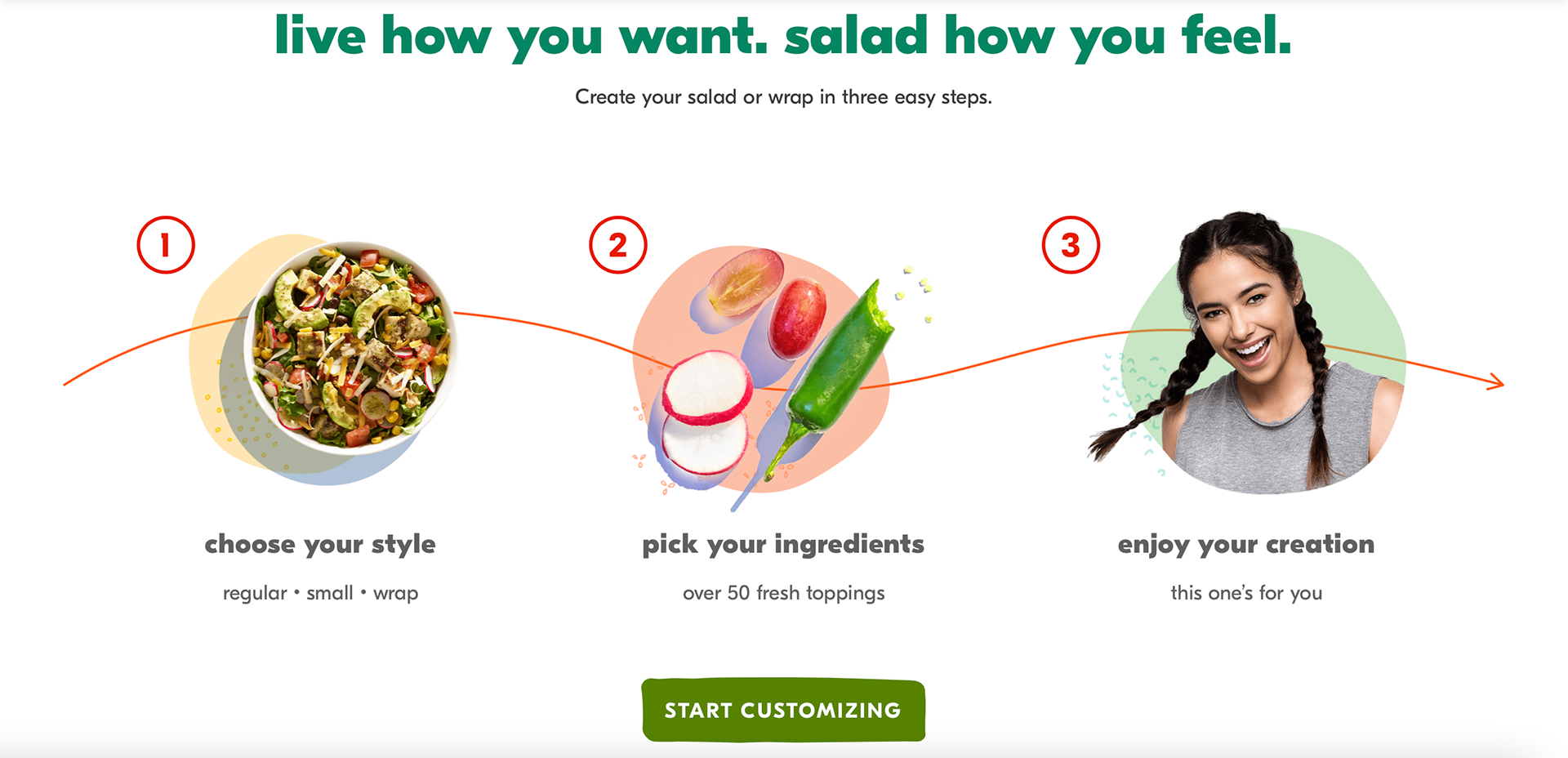
I enjoyed how cohesive the design of the website is. The illustrations are combined with images which adds a personal touch to the restaurant. The organic shapes seen on the website add movement to the images and the colors used make the products look fresh. The hero image promotes the app of the company with an 'order now' button that allows the viewer to order. The section is meant to promote the app but not bore or distract the viewer from the purpose of visiting the website which is to order food. As you continue to scroll down, the menu remains on the top of the web page allowing the viewer to access the menu when the viewer wants.
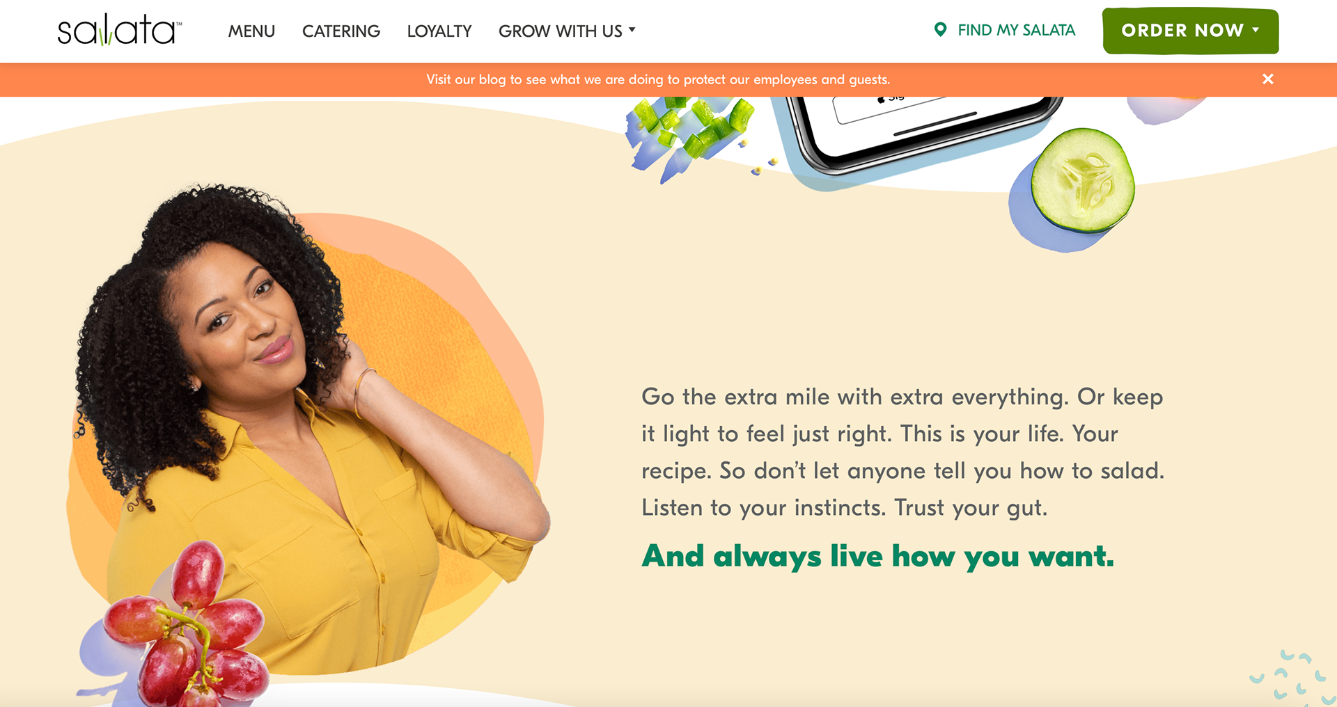
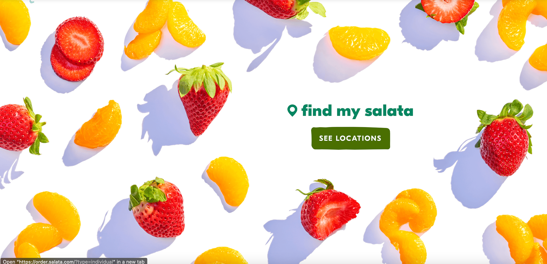
The white space on the website allows the elements not to look cluttered. As the viewer scrolls down, more information is seen but presented differently which keeps the viewer engaged with the website. The main color seen is green, it is in different shades and it represents the fresh plant aspect of the restaurant. Complementary colors are also seen which helps brighten the website more. The fonts are friendly, making the website welcoming to everyone. One thing I do not enjoy about the website is the heavy font used in some of the text. I think it would have worked fine if the weight wasn't as heavy as it is.