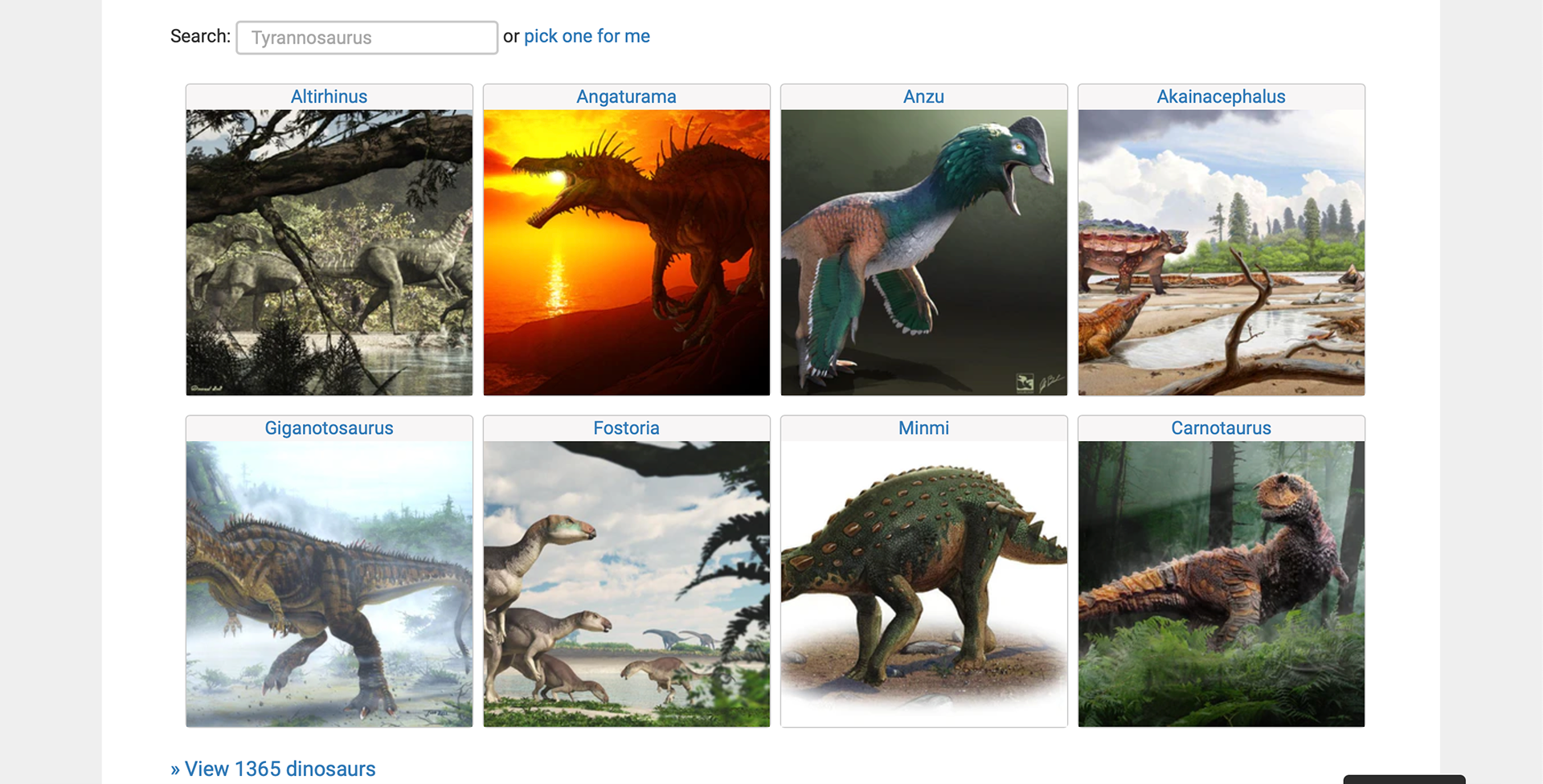
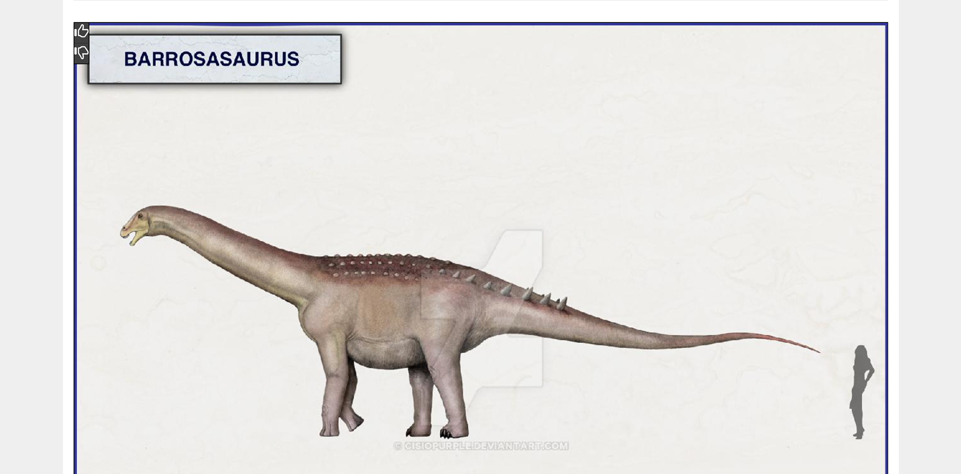
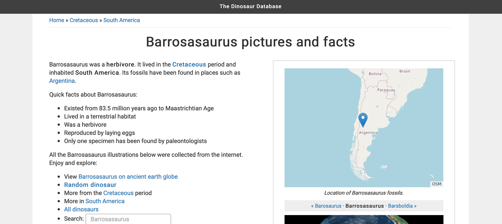
I love dinosaurs and I do not know why this website makes them look so boring. The website uses neutral colors and the only other colors are the colors seen in the illustrated images of the dinosaurs. There is no hierarchy and all of the text makes me not want to read the cool facts about dinosaurs. The sections on the website are cool but they are not appealing. They also blend in with the rest of the text making it look like it is all one block of text. The website tab has a cute dinosaur and I wonder why the actual website didn't incorporate that illustration in the design of the website. The purpose of the website is to be informative but I do think the organization of the text could be better. Adding color would also help the website look more engaging and fun to look at.