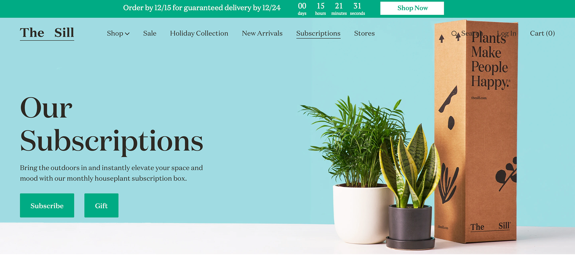
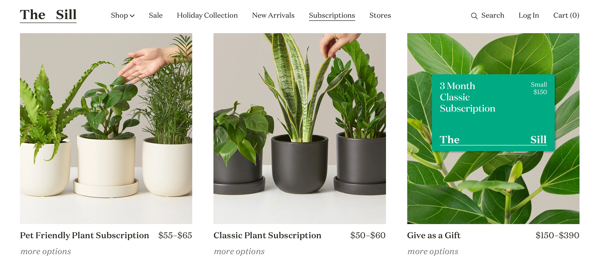
The SIll is a plant company that offers a subscription to get different plants. The primary color of the company is a very light bright green color. The font used for the logo is a serif font with a high stroke contrast. The website does a good job of allowing the green in the plants draw the viewer in. The plants look lovely and healthy making the viewer want to buy the plants. The design is a minimalist and clean design that allows the product to breathe in the space it is placed in. The first thing a viewer sees is the subscription box with plants the box could come with. The bar menu seen on the top part of the website overlaps the package design, ruining the look of the package. The colors of the package allow the vibrant green colors in the plants to stand out. The subscriber perks give the viewer a reason to get a subscription with the company. The graphics beside the text worked well but think they can be larger and the text can be simplified to allow everything to breathe in that section. One this I found interesting about the design of the website was when I clicked on the logo the words separated and were on opposite sides of the page. The last image shows something similar to the subscriber perks section but I think the lat image organizes the information a lot better than the other section.