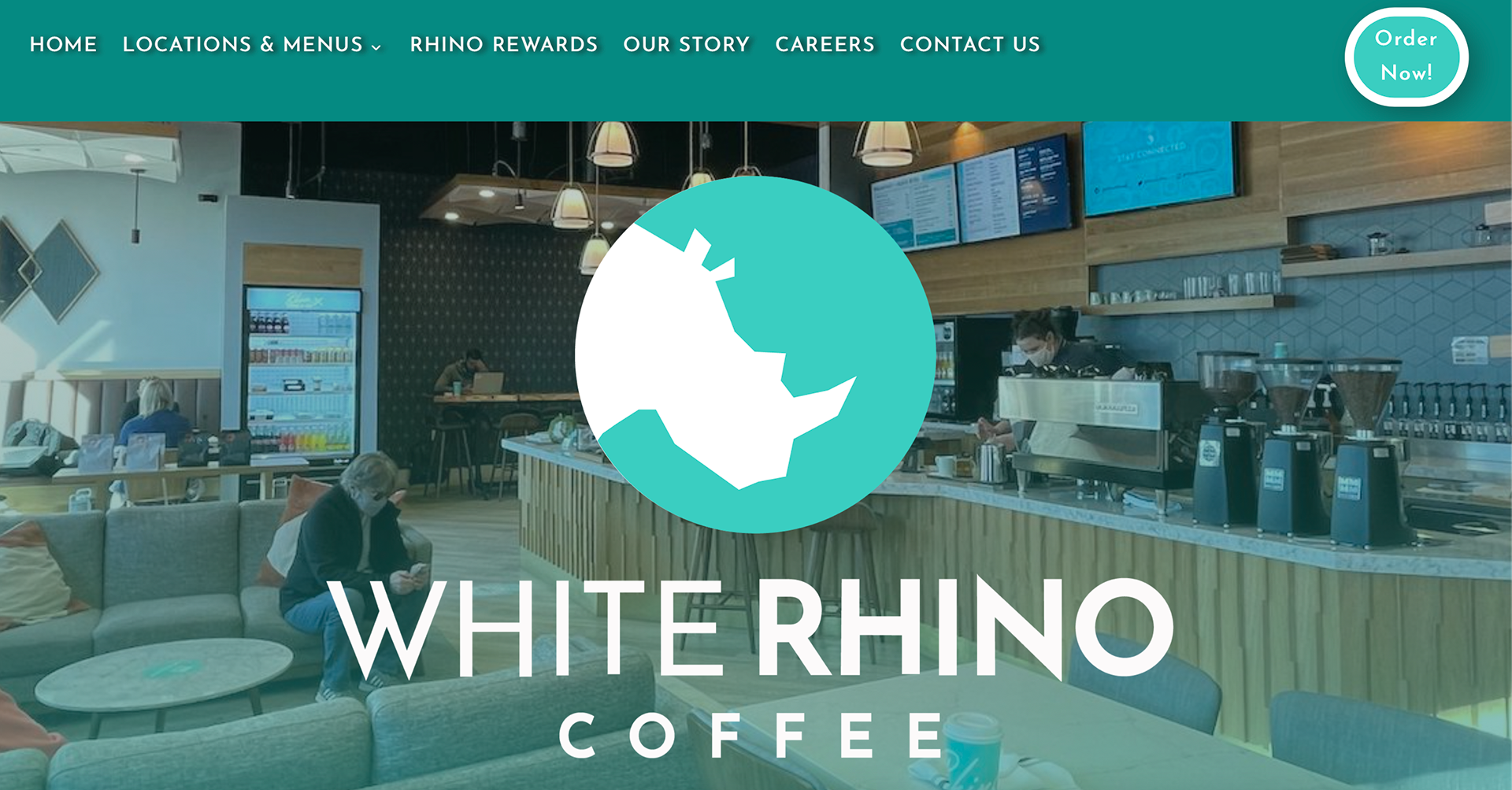
The White Rhino website is interesting to look at because the company color is seen everywhere on the website which maintains the website cohesive but slightly overwhelming to look at. The first thing seen is an image of one of the coffee shop locations with the logo overlapping the image. The bar menu is seen at the top and remains on the top as you scroll down the webpage. I do not like the dark shade or blue that is used throughout simply because it makes the website look a little dull. The bright order now button has a nice color and I think that is what makes the darker shade look so dull. The shape of the bottom looks awkward and out of place. I think if the oval was stretched horizontally it would have looked a lot better from what it currently looks like. The thick outline is predominant and stands out more than the text inside does which I think is a problem.
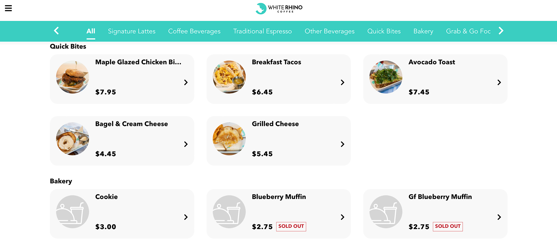
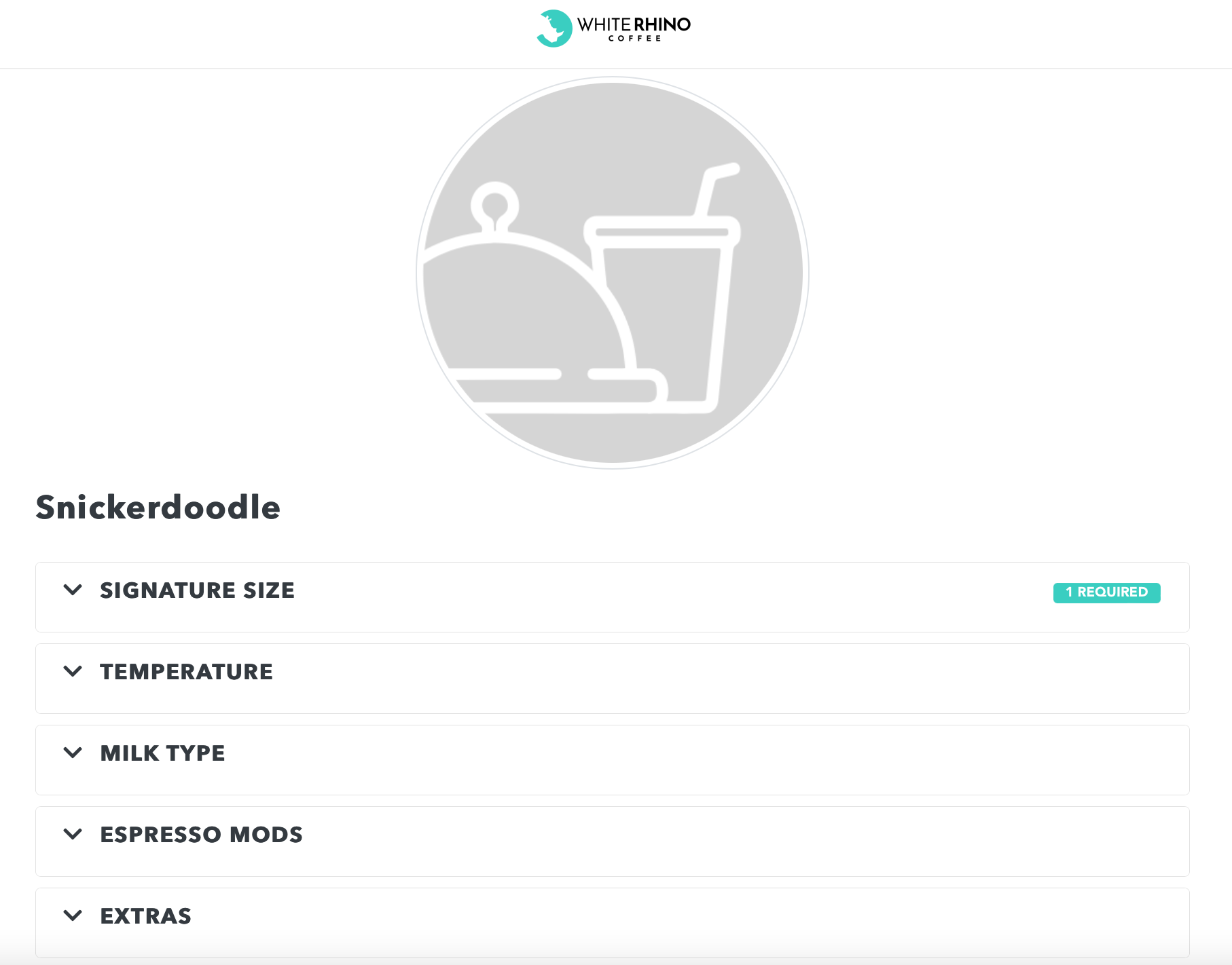
As you scroll down a few illustrations are seen in the webpage. The illustrations are simple but work well with the company. It also does not distract from the focal point which is the food being advertised. The tree made out of gift cards is nice and cute but there is a lot of text on the left side of the section. I think the smaller text could have been placed on the webpage the button leads to. The text small text could be replaced with a phrase that will give a hint of the gift card offer instead of listing it all. One thing I found very interesting about the website was the ordering process which I think is annoying when ordering from them. I always have a hard time navigating the menu simply because there are no images! I like looking at the images because they help me decided what I would like to buy. A few pictures are seen in certain items but not all of them and when one scrolls fast, looking for a specific item it can take a while to find the desired item.