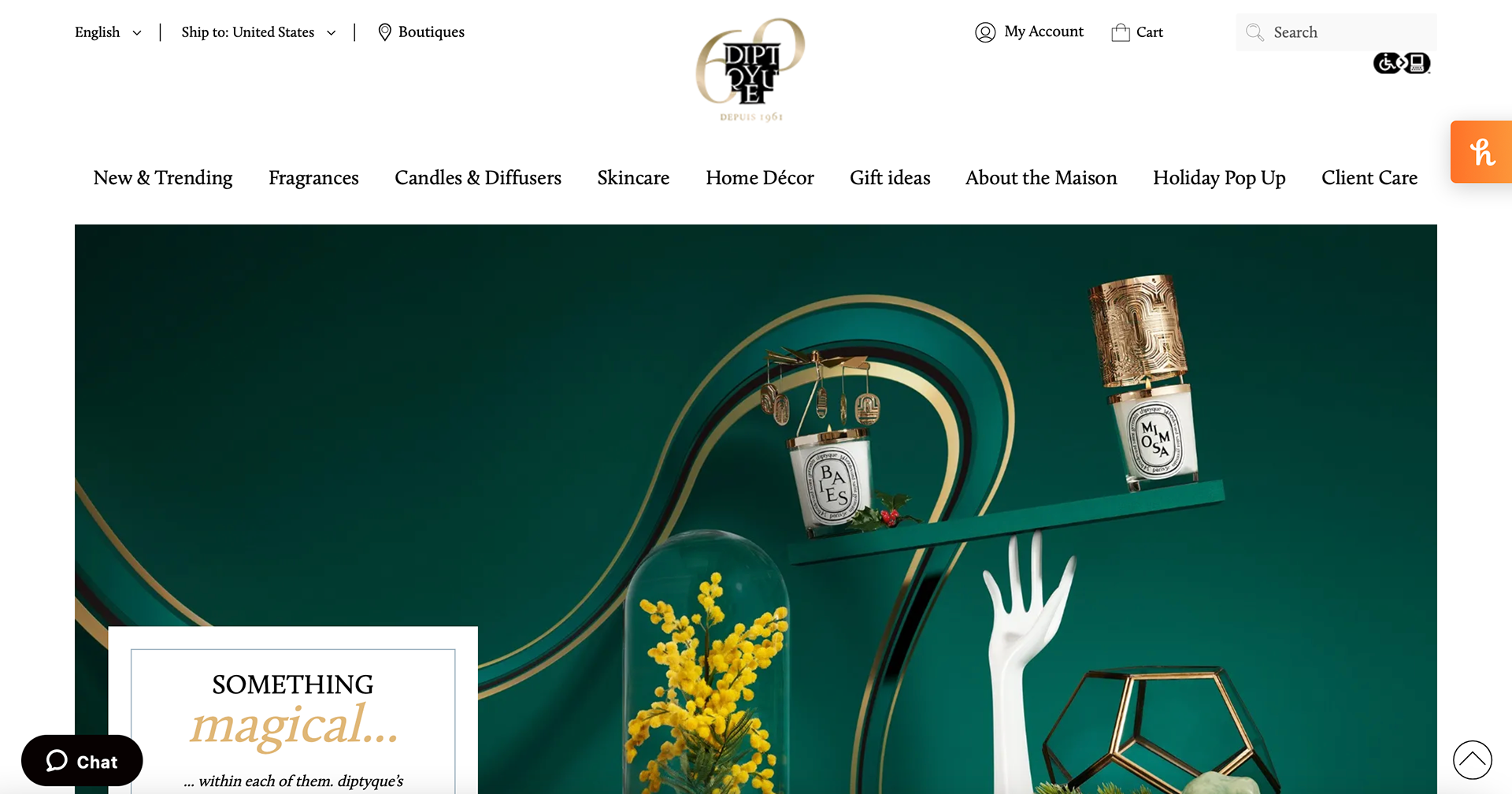
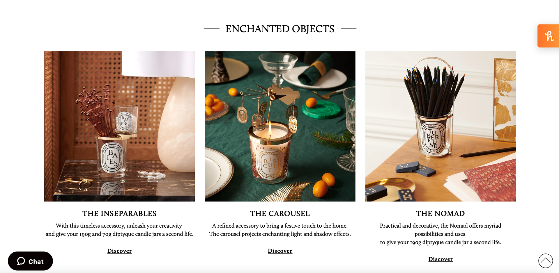
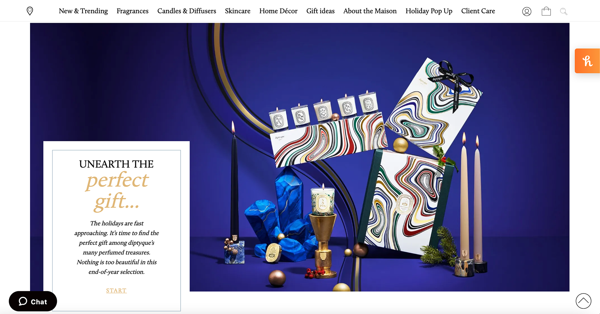
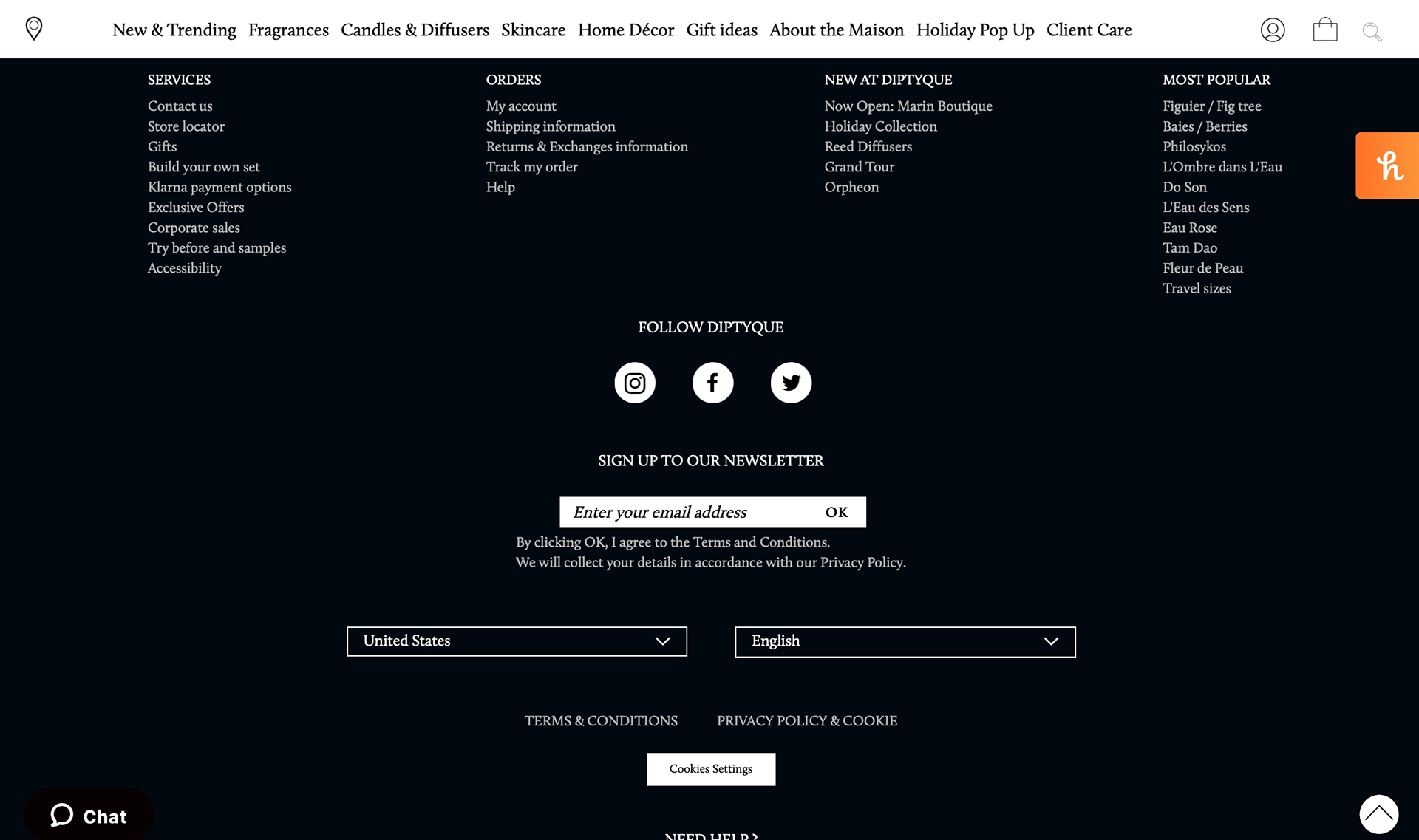
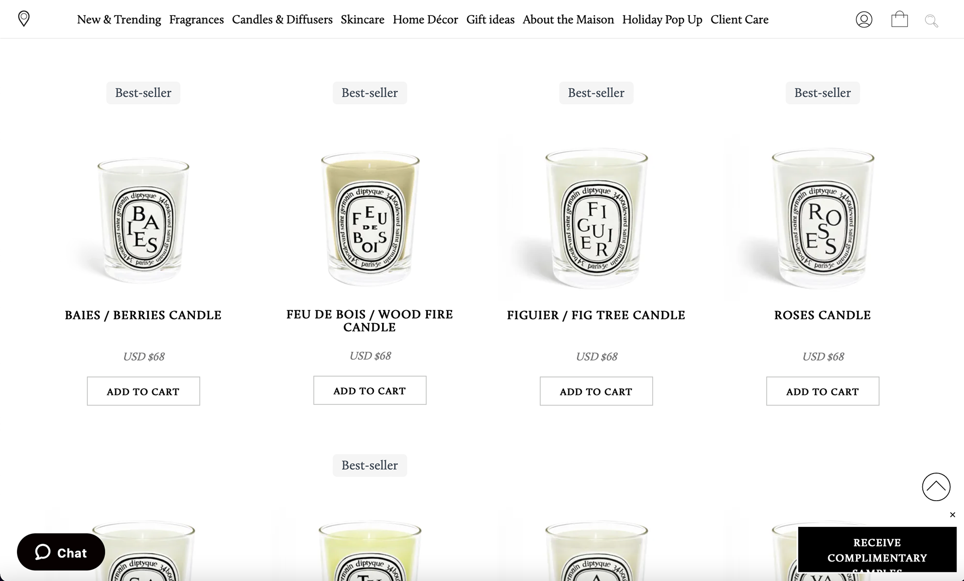
The Diptyque website has a modern and clean design that compliments the colorful and artistic images used to make the product look appealing to the audience. The logo uses a serif font and the letters are arranged to fit in a strange shape. The number 60 is behind the logo letting the viewer know it is the companies the 60th anniversary. The candles are the main products being advertised even though they do sell other products. The first thing seen when you open the website is the bright whimsical image advertising the holiday candles the company has. The product page is plain and the only thing a viewer can really see is the labels on the candles. The viewer is able to tell there are several candle scents from the big letters seen in the center arranged to spell out the scent of the candle. The footer is black with white text maintaining the modern look throughout the entire website. The overall aesthetic of the website fits with the high-end candle brand.